#Set Font Fallback Settings for Rendering
Explore tagged Tumblr posts
Visit Tumblr Blog
Explore Tumblr blogs with no restrictions, modern design and the best experience.
Last Seen Tumblr Blogs


Fun Fact
Tumblr Inc. is using 66 technologies for its website.
Text
How Web Fonts Impact Core Web Vitals and How to Avoid Performance Issues?
A fast, smooth website keeps visitors engaged, but slow loading times can send them away. One overlooked culprit? Web fonts. While they enhance design, they can also harm site performance, affecting your Core Web Vitals—Google’s key metrics for user experience. If your site depends on custom fonts, understanding how to optimise them is crucial. Are your website designs not ready for customer interaction? Hire Graphic Designer in Sydney at Craze For Marketing today!
Why Web Fonts Can Slow Down Your Site
Web fonts load separately from the rest of your page, and delays can cause:
Flash of Invisible Text (FOIT): Users see blank spaces where text should be while fonts load.
Flash of Unstyled Text (FOUT): Text appears in a default font before switching to the intended one.
Increased Page Load Time: Large font files can slow down rendering, making users wait longer.
Cumulative Layout Shift (CLS): Fonts loading late can cause content to jump, affecting readability and interaction.
Google’s Core Web Vitals measure user experience, focusing on Loading (Largest Contentful Paint), Interactivity (First Input Delay), and Visual Stability (CLS). Poor font management negatively impacts all three.
How to Optimise Web Fonts for Better Performance
Improving font loading ensures your website stays fast while maintaining a polished look. Here’s how:

1. Use Fewer Font Variations
Each additional weight or style increases the number of files your site must load. Stick to essential variations to reduce strain on performance.
2. Preload Key Fonts
Preloading tells browsers to fetch fonts earlier, reducing delays. Add this to your HTML:
<link rel="preload" href="your-font.woff2" as="font" type="font/woff2" crossorigin="anonymous">
3. Choose Modern Font Formats
WOFF2 files are smaller and load faster than older formats like TTF or OTF. If your site still uses outdated fonts, it’s time for an update.
4. Use System Fonts Where Possible
System fonts like Arial, Helvetica, and Times New Roman load instantly because they’re already available on users’ devices. A mix of system and custom fonts can balance style with speed.
5. Font Display Settings Matter
Setting font-display: swap; in your CSS allows text to be shown in a fallback font while the custom one loads, preventing FOIT.
@font-face {
font-family: 'CustomFont';
src: url('customfont.woff2') format('woff2');
font-display: swap;
}
6. Optimise Hosting and Delivery
Hosting fonts locally rather than relying on third-party services can speed up delivery. If using Google Fonts, generate a subset to only load the characters your site needs.
7. Reduce CLS With Consistent Font Sizing
Set specific font sizes and line heights to minimise layout shifts when fonts load.
The Role of a Professional Design Team
Ensuring fonts don’t impact Core Web Vitals requires technical know-how. A well-designed site should be visually appealing without sacrificing speed. Businesses looking to maintain both can benefit from expert design services.
If you need assistance balancing aesthetics and performance, hiring a professional designer can make all the difference. Those looking to hire a graphic designer in Sydney should choose one who understands the impact of fonts on web performance.
Final Thoughts
Web fonts can enhance your brand identity, but without proper handling, they can slow your site and hurt rankings. By optimising font loading, businesses can create a smooth user experience while keeping Google happy.Looking to improve your website’s performance? Hire a graphic designer in Sydney with expertise in optimising fonts and visuals for speed and style. Contact Craze For Marketing today to ensure your site performs as well as it looks.
0 notes
Text
How to Speed Up Your Webflow Site in 5 Easy Steps

In the digital age, website speed is paramount. A fast-loading site not only improves user experience but also boosts your search engine ranking. Webflow is a powerful tool for web design, but to fully harness its potential, you must ensure your site is optimized for speed. Here, we outline five essential steps to enhance your Webflow site's performance.
1. Optimize Your Images
Because they are frequently the largest files on a webpage, images have a big impact on load speeds. Here’s how to ensure your images are optimized:
a. Choose the Right Format
Using the appropriate image format can make a big difference. JPEG is ideal for photographs due to its compression capabilities, while PNG is better for graphics with fewer colors. WebP, a newer format, offers superior compression and quality, making it a good choice for most images.
b. Compress Images
Use tools like TinyPNG or ImageOptim to compress your images without compromising quality. Compressed images load faster and reduce the overall weight of your site.
c. Use Responsive Images
Leverage Webflow’s responsive image feature. It automatically generates various image sizes for different devices, ensuring that users only download the smallest necessary version.
d. Lazy Load Images
To ensure that images load only when they enter the viewport, enable lazy loading. This speeds up perceived performance and cuts down on the initial load time.
2. Minimize and Combine Files
Minimizing and combining your site’s CSS, JavaScript, and HTML files reduces the number of HTTP requests, which in turn speeds up your site.
a. Minify CSS, JavaScript, and HTML
Minification removes unnecessary characters (like white spaces, commas, and comments) from your code without affecting its functionality. Tools like UglifyJS for JavaScript and CSSNano for CSS are great for this purpose.
b. Combine Files
Whenever possible, merge several JavaScript and CSS files into one.This reduces the number of requests the browser needs to make, speeding up page load times.
c. Load JavaScript Asynchronously
By loading JavaScript files asynchronously, you ensure they don’t block the rendering of the page. This means the browser can continue loading other elements while it fetches the JavaScript.
3. Use a Content Delivery Network (CDN)
A CDN distributes your content across various servers worldwide, allowing users to load your site from a server closer to their location, which significantly reduces load times.
a. Choose the Right CDN
Popular CDNs like Cloudflare, Fastly, and Amazon CloudFront offer reliable services that can greatly enhance your site's speed and performance.
b. Enable Caching
CDNs cache your content, so subsequent visits to your site are faster. Ensure your CDN is configured to cache static assets like images, CSS, and JavaScript files.
c. Optimize Delivery
Leverage your CDN’s features to optimize content delivery. For instance, enabling Brotli or GZIP compression can further reduce file sizes and accelerate load times.
4. Reduce Webfont Usage
While webfonts can enhance your site’s aesthetic, they can also slow it down. Here’s how to optimize webfonts for better performance:
a. Limit the Number of Fonts
Employ a small selection of font weights and families.Each additional font adds to the load time, so stick to a maximum of two to three families.
b. Use Modern Formats
WOFF2 is the latest webfont format, offering better compression and faster loading times than older formats like TTF or EOT.
c. Optimize Loading
Consider loading webfonts asynchronously using the font-display: swap CSS property. This allows text to be displayed immediately using a fallback font until the webfont is fully loaded.
5. Enable Browser Caching
Browser caching stores certain files on the user’s device, so they don’t have to be re-downloaded on subsequent visits. This drastically reduces load times for returning visitors.
a. Set Expiration Dates
Set expiration dates on your server according to the different kinds of files.Static assets like images and CSS files can have a longer expiration period, while dynamic content should have shorter periods.
b. Leverage Cache-Control Headers
Use cache-control headers to define how and for how long browsers should cache your resources. The max-age directive specifies the maximum amount of time a resource is considered fresh.
c. Validate Cached Resources
Use the ETag and Last-Modified headers to validate cached resources. This ensures users receive the latest version of a resource if it has changed, while still benefiting from caching when possible.
Conclusion
By following these five steps—optimizing images, minimizing and combining files, using a CDN, reducing webfont usage, and enabling browser caching—you can significantly improve your Webflow site’s speed and performance. In addition to improving user experience, a quicker website raises your search engine rating and increases website traffic.
Website:- How to Speed Up Your Webflow Site in 5 Easy Steps
#Webflow#WebsiteSpeed#PerformanceOptimization#ImageOptimization#WebDesign#UserExperience#SEO#CDN#MinifyCSS#JavaScript#BrowserCaching#Webfonts#ResponsiveImages#LazyLoading#FileCompression#AsyncJavaScript
0 notes
Note
ok so (un)solicited advice:
your wikiplayer is very fragile. it gets blocked by both of my adblockers, requires you manually give it the sound permission, sends a bunch of tracking cookies to google, and hasn't been updated since 2016, when it still used adobe flash. no idea what to replace it with tho. if neocities allowed mp3 files, you could just use the native html5 player
the Papyrus font is not installed by default on windows. and you're using it without a fallback. also, because this kind of stuff can be used for tracking, my browser blocks it, even when it is installed! you should include the ttf file with css
you use javascript (it's not called java🙄) for the collapsible sections on your Math corner. this can actually be done just with the <details> tag in HTML!! as a rule of thumb, you should avoid for everything you can do without it. unless you're building a game :0
you hardcode the width of your images. and because your monitor is a bit bigger than the average (720p), they don't fit, even on desktop (i'm not even talking about mobile). you should probably add something like max-width: 100%; to their css. (having a website that doesn't work on mobile is fine btw)
you can use Katex (it's better than mathjax) to format your math all fancy like!!
on the MathCorner and ReadingCorner pages you messed up the css, and the background renders without a texture! you should use background-color: indigo; and not background: indigo; if you're just setting the color
you mix embedded css (<style> tag) and external css (<link> tag) in one project! both are fine, but it's generally better to have a separate .css file. because it's often the same for all the pages!
wow, you sure are passion8 about alot of my posts! :)
thank you!! i love all your little comments in the tags 💚
do you want to tell me something about your coding projects?👉👈
I'm glad you like my tags, it's where I live lol.
I literally learnt basic HTML code less than a week ago. I'm majoring in maths and IT which I am enjoying thoroughly but I simply haven't interacted much with actual IT stuff before. And this semester I have two IT units that will require me to know coding stuff, so I decided to try out neocities to at least increase my comprehension in a fun way before it becomes crazy vital.
Besides that it's just learning all the things I can do. Absolutely amazed at images as links! My current thing I'm trying is to make only part of an image a link. I'm trying to follow some W3 tutorial (or whatever it's called). Haven't got it working yet, but oh well.
I understand 0% Java, so there are two parts of my website that is just straight up copy and pasted.
Basically, I keep trying, failing, breaking something, undoing, fiddling, learning. And that's my coding projects lol.
11 notes
·
View notes
Text
Problem with Discord's new (and old) font(s) and its treatment of non-Latin text
Before getting into it, I'm gonna say that I'm not going to criticize its aesthetics or "readability". These feedbacks are rarely helpful from the designer's perspective especially coming from people who don't know much about what goes into designing a typeface, and because readability is really, really subjective.
I was happy to hear that discord was changing its font, especially when I found out that they are adding support for Vietnamese. Previously, discord used Whitney, a humanist sans serif font with Latin, Greek, and Cyrillic support. Unfortunately, Whitney doesn't support all Latin characters in Unicode, and crucially it doesn't support Vietnamese characters.
Text font not supporting a script is usually not a problem, the fallback font will take care of it for you. The problem occurs when there's partial support. Vietnamese uses Latin, but it also has a ton of precomposed vowels with diacritics. This is what Vietnamese looks like on my phone, where the font change hasn't taken effect yet:

here's the same text with unsupported characters highlighted in red:

It might not look that weird because the fallback font on my phone happened to be somewhat similar in style to Whitney, but depending on the device it may be completely unreadable. I submitted a feedback a while ago asking them to address this issue
This is why when I heard that discord was changing its font to add Vietnamese characters, I was excited. This is what the same text looks like in gg sans.

All characters harmonious!
However, after receiving the update I was disappointed because the new font now no longer supports Greek and Cyrillic. This alone is not really a big problem, because Greek, Cyrillic and Latin characters rarely occur in the same word. Although it is disappointing that they are no longer harmonious, it's not that big of a problem. The problem though, is that they decided to include Δ, Ω, μ, π (capital delta, capital omega, lowercase mu, and lowercase pi) into the font.

Depending on the device and rendering settings, it might look like it fits well with the fallback font, being almost unnoticeable, or so noticeable that it's hard to read. These four glyphs are often included in typefaces that only support Latin as they are often included in Latin lettersets because of their use in mathematics and science, so I thought it was simply an odd oversight.
Then I found out about this:
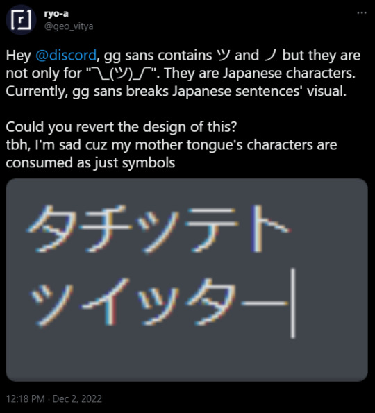
(As of 2022/12/3 9:22 pm UTC+9 I couldn't recreate this. It may be because of css setting or because they've already fixed it. I'm hoping it is the latter) They decided to include katakana characters to be only used in the shrug emoticon.
I was massively disappointed when I heard this news because it means they did not care at all about global accessibility when making the new font. I was under the impression that they were doing it at least partially to address this issue. I was under the impression that maybe they've heard us complain and complain about the font only having partial support for Vietnamese. Maybe they've realized the core problem. But no, it's clear that they still don't know what the problem is.
Maybe I should have realized it sooner. Did you know, Discord limits the amount of diacritics that can be attached to a single character, even though in a lot of non-Latin writing systems diacritics are crucial because they represent vowels, consonant clusters, et cetera?
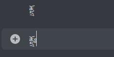
Moreover, did you know that Discord has a limit on how many diacritics you can have in a single message? This means if you have a copy pasta in abugida writing systems such as Devanagari, Thai, Khmer, Lao, Bengali, Burmese, et cetera, the vowel diacritics are just going to disappear after a while, rendering the text unreadable?

Affected portion underlined in red. I assume these are done to prevent zalgo, which really shouldn't be done by Discord itself, not to mention that typical "zalgo" diacritics are usually IPA diacritics with actual use, which can often stack in a zalgo-like fashion.
Did you know that Discord enforces strict text line height, even though some writing systems need more horizontal space than latin to be legible? Anything outside of the bounds are cut off and rendered invisible.
Anyway, do you remember when I said I wasn't going to talk about aesthetics and readability? I kind of lied. I am going to talk about them.
A lot of people seem to be saying that the new font is bad and that it's significantly less readable than the previous font. I have doubts about whether this is actually because of the font itself or because they're simply not used to it yet. My guess would be the latter. However, that doesn't mean the solution is to make these people shut up and wait till they get used to it.
There is no universal solution for readability and legibility. The truth is that different people have different needs, and this is no different when it comes to typefaces. Ideally, discord should provide an option to change fonts. Many platforms do. They've been refusing to implement it because, I dunno, brand image?
There is also a bigger problem with how UI designers design in general. They only design around Latin in mind, even though different writing systems use space differently. Many Brahmic scripts use ligatures and diacritics stacking above or below the main character. If you care about non-Latin scripts not appearing illegible, make it so that UI elements can accommodate for that, or something.
I'm bad at writing conclusions, so there you have it. Me rambling about a thing that I care about that apparently everyone else should too.
422 notes
·
View notes
Text
A Guide In Firefox to New And Creative CSS DevTools
Over the last few years, our team at
Firefox
has been operating on new CSS gear that address both cutting-edge strategies and age-old frustrations. We’re the Layout Tools team, a subset of Firefox Developer Tools, and our quest is to improve the modern-day internet layout workflow.
The internet has seen an first-rate evolution inside the final decade: new HTML/CSS functions, browser improvements, and design strategies. Our crew is dedicated to constructing gear that fit that innovation so that designers and developers can harness extra of the performance and creativity that’s now possible.
In this guide, we’ll proportion a top level view of our seven new equipment, with memories from the design system and realistic steps for trying out each tool.
1. Grid Inspector
It all started out three years in the past while our CSS format expert and dev advocate, Jen Simmons, labored with members of Firefox
DevTools
to construct a device that would aid customers in examining CSS Grid layouts.
As one of the most powerful new functions of the cutting-edge internet, CSS Grid had quick gained decent browser adoption, but it still had low internet site adoption. There’s a steep studying curve, and you nevertheless need fallbacks for sure browsers. Thus, part of our purpose turned into to help popularize Grid by way of giving developers a more hands-on manner to research it.
The middle of the device is a grid outline, overlaid at the page, which facilitates devs visualize how the grid is positioning their elements, and the way the layout modifications once they tweak their styles. We introduced numbered labels to identify each grid line, the capability to view up to 3 grids at once, and colour customization for the overlays. Recently, we also introduced support for subgrid, a modern day CSS specification implemented in Firefox and hopefully in extra browsers soon.
Grid Inspector changed into an idea for all of the tools that followed. It was even an notion for a brand new team: Layout Tools! Formed in late 2017, we’re unfold across 4 time zones and collaborate with many others in Mozilla, like our rendering engine builders and the best parents at MDN.
TRY OUT THE GRID INSPECTOR
In Firefox, go to our Grid example site.
Open the Inspector with Cmd + Shift + C.
Turn on Grid overlay through one of 3 ways:
Layout Panel:
In the Grid section, check the checkbox subsequent to .Content.Grid-content;
Markup View:
Toggle the “grid” badge next to ;
Rules View:
Click the button next to display:grid; inside
#page
-intro .Grid-content;
Experiment with the Grid Inspector:
Change the crimson overlay coloration to red;
Toggle “Line numbers” or “Extend strains infinitely”;
Turn on greater grid overlays;
See what takes place while you disable grid-gap: 15px in Rules.
2. The Editor of Form Path
The next project we have been working on has been the Shape Path Editor: our first visual editing tool.
CSS Shapes permits you to define shapes for textual content to drift around: a circle, a triangle, or a many-sided polygon. It can be used with the clip-path assets which permits you to trim elements to any of those equal shapes. These two techniques collectively open the opportunity for a few very specific graphic design-stimulated layouts.
However, creating these sometimes complicated shapes can be difficult. Typing all the coordinates manually and the use of the right CSS units is error-inclined and some distance eliminated from the creative mind-set that Shapes allows. Therefore, we made a device that allows you to edit your code through at once clicking and dragging shapes on the web page.
This kind of feature—visible editing—became new for us and browser tools in general. It’s an instance of how we will go beyond inspecting and debugging and into the world of design.
TRY OUT THE SHAPE PATH EDITOR
In Firefox, go to this web page at the An Event Apart website.
Open the Inspector with Cmd + Shift + C and pick out the first circular image.
In Rules, click on the icon subsequent to the shape-outside property.
On the web page, click on the factors of the shape and notice what happens while you drag to make the shape massive or tiny. Change it to a size that appears exact to you.
3. Text Reader
We have had a Fonts panel in Firefox for years which displays an informative list of all the fonts used in a website. We decided to convert this into a Font Editor to fine-tune the properties of a font by continuing our trend of designing in the browser.
A driving force behind this assignment become our purpose to support Variable Fonts at the same time that the Firefox rendering engine team changed into adding support for it. Variable Fonts gives font designers a way to offer fine-grained variations alongside axes, like weight, within one font file. It also supports custom axes, which offer each font creators and web designers an exceptional amount of flexibility. Our device routinely detects these custom axes and offers you a manner to alter and visualize them. This would otherwise require specialized websites like Axis-Praxis. Additionally, we added a characteristic that gives the ability to hover over a font name to spotlight in which that particular font is being used at the page. This is helpful because the manner browsers select the font used to render a bit of text can be complex and depend upon one’s computer. Some characters may be abruptly swapped out for a special font due to font subsetting. TRY OUT THE FONTS EDITOR
In Firefox, go to this variable fonts demo site.
Open the Inspector with Cmd + Shift + C and pick out the word “variable” within the title (the element’s selector is .Title__variable-web__variable).
In the 1/3 pane of the Inspector, navigate to the Fonts panel:
Hover over the font name Output Sans Regular to look what receives highlighted;
Try out the load and slant sliders;
Take a take a look at the preset font versions within the Instances dropdown menu.
4. Flexbox Inspector
Our Grid, Shapes, and Variable Fonts equipment can together electricity some very advanced graphic layout at the internet, but they’re still somewhat present day based on browser support. (They’re nearly there, however still require fallbacks.) We didn’t need to work most effective on new features—we were drawn to the problems that maximum web builders face on a every day basis.
So we started work at the Flexbox Inspector. Design-wise, this has been our most ambitious assignment, and it sprouted some new consumer research strategies for our team.
Like Grid, CSS Flexbox has a fairly steep learning curve while you first get started. It takes time to truely recognize it, and a lot of us hotel to trial and error to gain the layouts we need. At the beginning of the assignment, our team wasn’t even sure if we understood Flexbox ourselves, and we didn’t recognize what the main challenges have been. So we leveled up our understanding, and we ran a survey to discover what human beings wanted the most when it got here to Flexbox.
The outcomes had a big effect on our plans, making the case for complicated visualizations like grow/decrease and min/max. We continued operating with the community at some point of the task by means of incorporating remarks into evolving visual prototypes and Nightly builds.
The tool consists of two main parts: a highlighter that works just like the Grid Inspector’s, and a detailed Flexbox device inside the Inspector. The middle of the tool is a flex item diagram with sizing info.
With help from Gecko format engineers, we have been able to show the step-by-step size choices of the rendering engine to offer users a full image of why and the way a flex object ended up with a positive size.
Note: Learn the full tale of our design manner in “Designing the Flexbox Inspector”.
TRY OUT THE FLEXBOX INSPECTOR
In Firefox, visit Mozilla’s Bugzilla.
Open the Inspector with Cmd + Shift + C and pick out the element div.Inner (simply inside the header bar).
Turn on the Flexbox overlay through one of 3 ways:
Layout Panel:
In the Flex Container section, turn on the switch;
Markup View:
Toggle the “flex” badge next to ;
Rules View:
Click the button next to display:flex.
Use the Flex Container panel to navigate to a Flex Item known as nav#header-nav.
Note the sizes shown within the diagram and length chart;
Increase and reduce your browser’s width and see how the diagram modifications.
Interlude: Doubling Down On Research
As a small team and not using a formal person research support, we’ve regularly resorted to design-by-dogfooding: basing our critiques on our personal stories in using the tools. But after our achievement with the Flexbox survey, we knew we wanted to be better at collecting statistics to guide us. We ran a new survey to assist tell our subsequent steps. We crowdsourced a list of the 20 largest demanding situations faced by internet devs and asked our community to rank them using a max-diff format. When we discovered that the huge winner of the demanding situations was CSS Layout Debugging, we ran a follow-up survey on unique CSS insects to discover the largest pain points. We supplemented these surveys with user interviews and user testing. We also asked folks to rank their frustrations with browser developer tools. The clear pinnacle difficulty became moving CSS modifications returned to the editor. This became our subsequent project.
5. Changes Panel
The difficulty in shifting one’s work from a browser developer device to the editor is one of those age-old issues that we all just got used to. We were excited to make a easy and straight away usable solution.
Edge and Chrome DevTools got here out with versions of this device first. Ours is centered on assisting a wide range of CSS workflows: Launch DevTools, trade any patterns you want, and then export your modifications by means of either copying the overall set of changes (for collaboration) or simply one changed rule (for pasting into code). This improves the robustness of the whole workflow, such as our other format tools. And this is just a start: We recognize accidental refreshing and navigation from the web page is a huge source of facts loss, so a manner to bring persistence to the tool may be an essential next step. TRY OUT THE CHANGES PANEL
In Firefox, navigate to any website.
Open the Inspector with Cmd + Shift + C and pick an element.
Make some adjustments to the CSS:
Modify patterns inside the Rules pane;
Adjust fonts within the Fonts pane.
In the right pane of the Inspector, navigate to the Changes tab and do the following:
Click Copy All Changes, then paste it in a text editor to view the output;
Hover over the selector name and click Copy Rule, then paste it to view the output.
6. Inactive CSS
Our Inactive CSS feature solves one of the top troubles from our layout debugging survey on precise CSS bugs: “Why is this CSS assets now not doing anything?”
Design-wise, this feature is very simple—it grays out CSS that doesn’t affect the page, and shows a tooltip to give an explanation for why the property doesn’t have an effect. But we understand this can enhance efficiency and cut down on frustration. We have been bolstered by research from Sarah Lim and her colleagues who constructed a similar device. In their studies, they observed that novice builders had been 50�ster at building with CSS when they used a device that allowed them to ignore beside the point code.
In a way, that is our favorite sort of feature: A low-placing UX fruit that barely registers as a feature, however improves the complete workflow without actually wanting to be determined or learned. Inactive CSS launches in Firefox 70 but may be used now in prerelease variations of Firefox, consisting of Developer Edition, Beta, and Nightly. TRY OUT INACTIVE CSS
Download Firefox Developer Edition;
Open Firefox and navigate to
wikipedia.Org;
Open the Inspector with Cmd + Shift + C and choose the center content material area, called central-featured;
Note the grayed out vertical-align declaration;
Hover over the data icon, and click on “Learn extra” if you’re interested.
7. Accessibility Panel
Along the way we’ve had accessibility functions developed by means of a separate group that’s typically one person — Yura Zenevich, this year together with his intern Maliha Islam.Together they’ve turned the brand new Accessibility panel in Firefox into a powerful inspection and auditing tool. Besides displaying the accessibility tree and properties, you could now run different varieties of checks on a page. So far the checks include shade contrast, textual content labels, and keyboard attention styling.
Now in Nightly, you can strive the new shade blindness simulator which harnesses our upcoming WebRender tech.
TRY OUT THE ACCESSIBILITY PANEL
Download Firefox Developer Edition;
Navigate to
meetup.Com;
In the developer tools, navigate to the Accessibility tab, and click the “Turn on Accessibility Features” button;
Click the drop-down menu subsequent to “Check for problems” and pick out “All Issues”;
Take a have a look at the diverse contrast, keyboard, and text label troubles, and click the “Learn greater” links if you’re interested.
Next Up
We’re currently hard at paintings on a browser compatibility tool that uses facts from MDN to expose browser-specific problems for a particular element. You can follow along on GitHub to learn extra. The Future
We’re committed to helping the modern-day web, and that means continuously converting and growing. New specs get implemented via browser vendors all of the time. Guidelines and nice practices around progressive enhancement, responsiveness, and accessibility evolve constantly. Us device makers need to hold evolving too.
And what of the long-lived, ever-present troubles in creating the web? What ordinary user interfaces need to be rethought? These are a number of the questions that preserve us going!
What approximately a better manner to navigate the DOM tree of a page? That a part of DevTools has gone essentially unchanged since the Firebug days.
We’ve been experimenting with functions like again and forward buttons that might ease navigation between lately visited elements. A extra dramatic trade we’re discussing is including a compact DOM view that makes use of a syntax much like HTML templating engines. The attention could be on the most common use case—navigating to CSS—as opposed to viewing/enhancing the source.
We’ve additionally been thinking about a higher element selector. We realize how it can be more effective to work inside the web page, with much less jumping backward and forward into DevTools. We should make the detail selector extra effective and greater persistent. Perhaps it could choose whitespace on a page and tell you what causes that space, or it can shed mild at the relationships between extraordinary elements.
As a reputed Software Solutions Developer we have expertise in providing dedicated remote and outsourced technical resources for software services at very nominal cost. Besides experts in full stacks We also build web solutions, mobile apps and work on system integration, performance enhancement, cloud migrations and big data analytics. Don’t hesitate to
get in touch with us!
Source:
whizzystack.co
#b2b ecommerce
#b2b content marketing
#b2b seo
#b2b marketing blog
1 note
·
View note
Text
Set Font Fallback Settings for Rendering & Insert Empty Field in Word Document using Java
What's New in this Release?
Aspose development team is happy to announce the monthly release of Aspose.Words for Java 18.10. The release of this month contains number of new features, enhancements and bug fixes of the issues reported by Aspose users in previous versions. A new feature has been added in Aspose.Words 18.10 to set font fallback settings. Font fallback is used when font is resolved but it doesn’t contain a specific character. It has added new property FontSettings.FallbackSettings to set the settings related to font fallback mechanism. A new class FontFallbackSettings is also added for fallback mechanism settings. It has added new property NodeRendererBase.BoundsInPoints in this release to get the actual bounding box of the shape as rendered on the page. It has added two new properties named Style and StyleName in StructuredDocumentTag class to set or get the style applied to content control. A new feature has been added in this version of Aspose.Words to copy all styles of document into another document. MS Word allows to insert empty field into document. It has added this feature in Aspose.Words 18.10 to insert empty field into document. A new property Table.AllowCellSpacing has been added in this version of Aspose.Words to set or get the option “Allow spacing between cells” of table. It has added new feature in Aspose.Words 18.10 to insert horizontal rule into document. A new method InsertHorizontalRule() has been added to DocumentBuilder class. There are 84 improvements and fixes in this regular monthly release, such as Aspose.Words for Java is FIPS compliant now. The single sentence ‘SecuritySettings.startFipsMode()’ switches current Aspose.Words thread to the FIPS mode, Support Conholdate.Total for Java licensing system, Compatibility within GroupDocs Total package is improved, Just another Veracode Security Scan Report is fixed, Java 10/11 compatibility updates caused few bugs on some old Java Runtime Environments. We managed to fix these bugs quickly, Massive JavaDoc fixes, Aspose.BarCode compatibility changed to a new architecture that started from v.18.8. BarCode inside AW documents is more consistent now, Implemented new API to set up font fallback mechanism through XML configuration, Provide option to Use a style to format text typed into the SDT control and many more. The list of most notable new and improved features added in this release are given below
The language detection of every Run object
Rupee symbol does not render in PDF when old version of Arial font is used
Provide option to Use a style to format text typed into the SDT control
Add ability to remove paragraphs becoming empty after template extressions are evaluated to empty values
Add feature to remove list item when data source is empty or null
Remove empty paragraph when IF condition returns false in LINQ Reporting
Add feature to remove last list number when HTML is inserted by LINQ Reporting
WordArt rendering support (advanced features)
FIPS compliant version of Bouncy Castle
Fonts are substituted improperly
Support 'Conholdate.Total for Java' licensing system
GroupDocs Total License: resource name conflict after obfuscation
Links to internal members in public API Documentation
Strange white thick line added to the table
Some metadata properties are missing after document saving
Try to render PNG images with corrupted structure // DOCX to PDF - image is lost
Check Veracode Security Scan report
Shapes (Math equation) do not render correctly
Java documentation for GraphicsQualityOptions settings
"Bad cref:" warning in public API due simplified see tag
Missing javadoc for method with array in signature
Links to .Net system members in Java's javadoc
Remove '#Error Cref' warning errors from public API.
Bad size of border around Barcode image.
Javadoc is missing package-list file.
Hebrew characters are not generating properly from rtf specified format
An invalid characters encoding when saving RTF document to a string
Links to internal members in public API Documentation.
Generic Type is absent in public API
PDF output is corrupted after some page
Missing Text when converting RTF
Space characters in an OfficeMath equation disappear after conversion to MathML
Document is not rendered properly
Word to PDF - Bookmark creation issue with style separator
DOCX to PDF conversion issue with English and Chinese text
Document.PageCount returns wrong value
Add feature to insert Horizontal Rule into document
Aspose.Words produces invalid EPUB documents if HtmlSaveOptions.Encoding is not UTF-8 or UTF-16
A picture at bottom right corner of first page moves inches towards left in PDF
Incorrect rendering of X-axis labels after converting to PDF
Converting Word to Pdf the text layout in Pdf is not correct
Extracted Ole Object has wrong Signature and Binary values differ every time Aspose.Words code executes
TextBox Picture are not preserved in rendered PDF
Document.UpdateFields does not update the TOC field under Swedish culture
Large tables flow off the side of the page when rendering
Incorrect Table/Cell widths are exported to PDF
Header/Footer cut off at the right side of page after conversion from Doc to Fixed file format
Tables appear behind the Shapes in rendered PDF
Docx to Pdf conversion issue with text indentation
Other most recent bug fixes are also included in this release
Newly added documentation pages and articles
Some new tips and articles have now been added into Aspose.Words for .NET documentation that may guide users briefly how to use Aspose.Words for performing different tasks like the followings.
Copy All Styles from Template
Font substitution and Font fallback in Aspose.Words
Overview: Aspose.Words
Aspose.Words is a word processing component that enables .NET, Java & Android applications to read, write and modify Word documents without using Microsoft Word. Other useful features include document creation, content and formatting manipulation, mail merge abilities, reporting features, TOC updated/rebuilt, Embedded OOXML, Footnotes rendering and support of DOCX, DOC, WordprocessingML, HTML, XHTML, TXT and PDF formats (requires Aspose.Pdf). It supports both 32-bit and 64-bit operating systems. You can even use Aspose.Words for .NET to build applications with Mono.
More about Aspose.Words
Homepage Java Word Library
Download Aspose.Words for Java
Online documentation of Aspose.Words
#Set Font Fallback Settings for Rendering#Get Actual Bounding Box of Shape#Set Style of Content Control#Copy All Styles from Template#Java Word Processing APIs#Insert Empty Field into Document#Allow Spacing Between Cells of Table
0 notes
Text
Email Design: Your Handy Guide to Create Winning Emails
Despite the emergence of a plethora of marketing channels, email still continues to enjoy maximum popularity and effectiveness among all businesses. Statista has revealed that 306.4 billion emails were sent and received every day in 2020. This number is set to rise to 361.6 billion in 2024. That’s a huge number.
At the first glimpse, this looks pretty impressive, but if we give a second thought, it reflects a big challenge for email marketers. Since the subscribers are so inundated with emails each day, it is obvious that they are simply scanning through your emails.
That’s why you must focus on creating unique email designs that are aligned with the industry best practices.
Keeping this flowchart in mind, let’s get into the nitty gritty of email design best practices that help to create a winning campaign.
Have an instantly recognizable From name
The From name is the first thing that your subscriber will notice whenever you send an email. Have your brand name as the from name as it will be easily identifiable and most subscribers will be familiar with it.
Craft a captivating subject line
Your subject line should be short, personalized, and pique the subscriber’s curiosity. It must convey the purpose of your email and entice the user to open it. Keep it up to 65 characters so that the email clients does not truncate it.
You can even try out different emojis in the subject lines to add a personal touch to your emails.
Elaborate the subject line through the preheader text
30-55 characters are perfect for the preheader text. It must work as an extension of your subject line and tell the readers more about what they can expect in the email.
Maintain a clean email layout
The number one rule of creating impactful email designs is to get rid of unnecessary clutter and distractions for the subscriber. Place the copy, images, and CTA in such a way that the information is easy to consume and navigate through. Keep plenty of white space and follow the inverted pyramid design pattern.
Place the logo at the top followed by the hero image and header text.
Use grid-based layers to create a simplistic design.
Maintain the text to image ratio at 80:20.
Have enough white space around the CTA and design it with a contrasting color so that it immediately draws the reader’s attention.
You can divide the content into smaller chunks with the help of bullet points or separators.
Make use of appropriate fonts and typography that matches your business type and industry.
Add suitable visual elements and interactivity
According to human psychology, visuals appeal more to us when compared to text. Therefore, you must have relevant imagery to go with the copy, whenever possible. This is a good idea when you have too much information to share. For example: If you want to let your subscribers know the usage of your product, you can have an explainer video or GIF rather than a wall of text.
Furthermore, you can also use interactive elements such as accordions if you want to convey more in the limited space of emails.
Just make sure that you do not miss out on Alt-text and proper fallback while using rich media and interactivity in emails.
Design a responsive email
39% emails were opened on mobile devices in 2020. Therefore, you must design responsive emails that render well across all devices and email clients.
Here are the points to help you create a responsive email:
Use a single column layout.
Maintain the title font size at 22px and copy line width of 6 words.
Line spacing should be 1.5 times the size of the font.
According to Apple, the CTA button should be 44×44 pixels and the font size should be 16px or more. This will help to create easily tappable buttons for mobile devices.
Do not ignore the email footer
Most marketers tend to overlook the email footer. That is a big mistake. You must pay attention to visual hierarchy even in the footer. Links to the social media platforms go a long way in boosting your brand visibility and getting organic followers. Separate the footer from the rest of the email by using a different background color. Your footer must always have important contact information along with your physical address. This is also crucial according to the anti-spam guidelines.Besides, you must also add an unsubscribe link in the email footer.
The fine print must include a disclaimer that lets the recipients know why they are receiving the email. Doing so can reduce the spam complaints and enhance your brand reputation.
Make your emails accessible
It is unfortunate that 2.2 billion people all over the world are suffering from visual impairment. To make things easier for them, it is critical to abide by the email accessibility guidelines.
Here’s how:
Arrange the email content in such a way that it reflects a logical reading order.
Semantic tags and headers must be used for the subscribers using screen readers. This will help them in comprehending the hierarchy.
Center-aligned copy is a strict no-no because reading it will be tough for dyslexic patients.
To make sure that the color blind population can access your emails, you must maintain a sufficient color contrast in all the email elements.
9. Build a Dark Mode compatible email
Most of your subscribers have switched to Dark Mode on their devices. Therefore, it is imperative to build Dark Mode compatible emails that render well irrespective of the settings.
If you miss out on creating a Dark Mode compatible email, it will spoil the subscribers and turn them off. Take a look at this broken Dark Mode email.
10. Your emails must load without any unnecessary delay
In case you have added animations or embedded videos in the email, you must double check its loading speed. The visuals should not add to the loading time, otherwise it might annoy your subscribers.
Wrapping Up
Most businesses are using drag-and-drop builders to send out their emails. However, you must try to create impressive email designs to boost the subscriber engagement and yield a higher conversion rate. Serve freshness in the subscriber’s inbox by sending out professional and classy emails that are aligned with the email design best practices and technological advancements.
The post Email Design: Your Handy Guide to Create Winning Emails appeared first on Scoop.it Blog.
Email Design: Your Handy Guide to Create Winning Emails published first on https://improfitninja.weebly.com/
0 notes
Text
Elementor Replace Addresses Core Internet Vitals
New Post has been published on http://tiptopreview.com/elementor-update-addresses-core-web-vitals/
Elementor Replace Addresses Core Internet Vitals
Fashionable WordPress web page builder plugin Elementor introduced an replace targeted on delivering sooner web page masses. The replace introduces improved efficiencies in how JavaScript and CSS recordsdata are delivered. These adjustments promise to enhance Core Internet Vitals scores.
In accordance with the Elementor’s announcement:
“The corporate has optimized its growth cycle and created a five-track plan fixated on particular efficiency areas corresponding to Optimized Asset Loading, JavaScript/CSS Libraries, Optimized inner JavaScript and CSS, Optimized Backend and Rendering Processes, and extra slim code output.
Elementor’s plan ensures that each one features of efficiency obtain vital enhancements, back and front.”
Elementor has additionally launched a manner for publishers to point easy methods to load Google Fonts extra effectively:
“A new Google font loading feature personalizes users’ loading experience, enabling them to modify how Elementor loads Google Fonts. Elementor dashboard settings offer auto, swap, block, optional, and fallback.”
Core Internet Vitals
Core Internet Vitals are metrics designed to measure the precise internet web page expertise for precise customers on cell units. The measurements are collected by customers on Chrome who’ve opted in to offer the knowledge which is then collected because the Chrome Consumer Expertise (CrUX) Report.
Commercial
Proceed Studying Under
It’s this information that’s used to create the Core Internet Vitals scores for web sites which in flip will turn into a rating sign in June 2021.
Internet hosting an internet site at a quick server won’t enhance the core internet vitals scores as a result of the issues that trigger core internet vitals are within the code of the web site itself.
Delivering that code sooner from a quick internet host received’t repair the code that needs to be downloaded and rendered on a cell system.
That’s why it’s vital for the makers of web site templates and web page builders to make the code their customers depend on extra environment friendly.
What Elementor introduced is their renewed effort to ship the net web page code extra effectively to assist publishers give their web site guests a greater person expertise and assist the publishers rank higher.
Why JavaScript and CSS Can Be Problematic
JavaScript and Cascading Type Sheets (CSS) are recordsdata that respectively present performance and visible model to internet pages. A JavaScript file could make a contact type work and the Cascading Type Sheet tells the browser what colours and fonts to make use of (amongst different visible model associated information).
Commercial
Proceed Studying Under
When an individual visits an internet web page the browser will obtain these recordsdata in an effort to create (render) the net web page. However the internet web page rendering will cease each time it encounters a JavaScript or CSS file. That’s why they’re known as Render Blocking Information.
Whereas there are coding ways to delay downloading the recordsdata or to obtain them in parallel (concurrently with different recordsdata), these recordsdata nonetheless should be activated (so to talk) in an effort to full the rendering of the net web page.
The perfect method is to attenuate what number of recordsdata should be downloaded. One of the best method is to obtain absolutely the minimal quantity of JavaScript and CSS essential to create a given internet web page.
For instance, if an internet web page doesn’t comprise a contact type then there isn’t a must obtain the recordsdata essential to create a contact type.
This extra environment friendly method to downloading JavaScript and CSS is named conditionally loading. Which means to obtain them when they’re wanted and never downloading if they don’t seem to be wanted.
And that’s a part of what Elementor introduced.
Elementor Is Now Extra Environment friendly
What Elementor modified was to obtain many JavaScript recordsdata solely when they’re wanted. That’s known as loading recordsdata conditionally. Elementor confirmed to me that they’ve plans to start conditionally loading CSS within the close to future as effectively.
In accordance with Elementor:
“The Lightbox, Screenful, Dialog, and Share links libraries are all loaded conditionally…”
Elementor additionally introduced:
“The e-icons CSS file has also been split into two separate libraries – frontend and backend – saving up to 50KB on any given page load.”
One other enchancment is that CSS that solely impacts web site guests who’re Editors won’t be loaded robotically for all customers. Which means if a web site customer isn’t an Editor their browser will obtain much less recordsdata to make the net web page render, saving 17 kilobytes.
The Elementor staff shared this with me:
“Both our R&D team and our SEO team have been working on this project for the past 6 months, making sure that Elementor is fully compatible with the upcoming Web Vitals Google algorithm change. We’ve been focusing on reducing the number of DOM elements, rendering process optimization, dynamic asset loading, and much more.”
Commercial
Proceed Studying Under
Elementor Publishes Programs for Enhancing Core Internet Vitals
Along with the code adjustments Elementor has taken the additional step to offer YouTube programs to assist them higher perceive greatest practices for constructing websites that present a sooner person expertise.
“To guide people through this update, we’ve made some excellent educational materials, including a new course on improving performance on your website. This will take a look at the whole process, since performance is based on a combination of factors, not just your website building platform of choice.”
Watch the Elementor optimization courses on YouTube here.
Elementor Takes the Initiative
It’s very heartening to see an increasing number of corporations step as much as make these vital updates. The announcement by Elementor is an thrilling growth for customers of the plugin and places the stress on the remainder of the WordPress ecosystem from plugins to theme makers to maintain up with its improvements.
if( !ss_u )// end of scroll user Source link
0 notes
Text
Version 436
youtube
windows
zip
exe
macOS
app
linux
tar.gz
I had a great few days mostly cleaning and fixing things. If you sync with the PTR, update will take a minute this week.
macos release polish
I cleaned up the new macOS release. It seems to have launched and otherwise generally worked last week, but there was a bug in finding the specific database location macOS users are used to. Without the '--d' launch parameter, it was creating an empty new db inside the app, in the 'db' dir hydrus would normally use (and the really old App used to use, if you remember that), and hence would say 'hey, this looks like the first time you are running the program...' on boot. I have fixed the 'I am running in an app' detection and the ~/Library/Hydrus database path calculation routine, so everything should be back to normal.
It also has the old readme and Applications shortcut in the dmg, and the filename should be fixed too. I expect this to be the only macOS release I put out from now on. Let me know if you have any more trouble!
miscount fix
Last week, I made the number in the 'pending (1,234)' menu title add up in a more efficient way. Rather than counting raw mapping rows every time, it uses a table of pre-computed numbers, the same used for autocomplete results. It turns out there were some legacy (from a long time ago) miscount bugs in there for some users. This resulted in a 'sticky' number that would not go away even after committing. A maintenance routine exists to fix this, but it is a sledgehammer when we need a scalpel.
So, I have written a maintenance routine to regen this pending data efficiently and correct these old bugs. It is basically the same as I did a few months ago with the 'display' caches during the siblings and parents work, but for a deeper level of tags. It will be run on update, along with a new thing that forces the menu's count to regen, both of which can now be accessed from database->regenerate menu in case we need them again in future. If you sync with the PTR, it may take a minute or so to finish.
I hope this will fix the issue completely, but if you still have a bad count, or if your count drifts off zero again over time, please let me know!
underscores
After discussion with some users, I have added an experimental setting to options->tag presentation that replaces all underscore characters in tags with space characters, as long as you are in 'front-facing' UI like regular search pages or the media viewer. It works on the same system as the 'hide namespace' option--and siblings--in that you still see the raw truth in manage tags and other edit locations.
This setting is experimental since it will add a bit of CPU lag to tag presentation and may result in some seemingly duplicate rows. I have long planned to fix the underscore issue with a really nice system, but I was convinced that adding a hacky system in the meantime would be a good thing to play with. If you care about this issue, give it a go and let me know if you run into any problems.
full list
macOS:
I fixed an issue with last week's Big Sur compatible release where it wasn't finding your old database correctly--it was defaulting to a different location, so without a specific launch command otherwise, it started a fresh db and said 'hey, looks like first time you ran the program'. if you are a long-time user of hydrus, please install and run 436 as usual, it should figure out your old db location correctly as ~/Library/Hydrus without any launch command override needed
If you never ran any of the old macOS builds, and you started using hydrus for the first time on macOS last week with the experimental Big Sur compatible build, your brand new database is in a funky location! don't update yet, or you will delete it! You will want to copy your .db files and the client_files folder from inside_the_435_app/Contents/MacOS/db to ~/Library/Hydrus, which should for most people be /Users/(YOU)/Library/Hydrus. feel free to ask for help if you can't figure this out
fixed a 'this is macOS' platform check for newer macOS releases, which ensures the 'userpath' fallback is correctly initialised to ~/Library/Hydrus
fixed the new macOS github workflow build script to tell hydrus that it is running from inside an App, so it knows to default to the userpath fallback correctly
the macOS build now has the old filename
it also has the ReadMeFirst.rtf file and Applications shortcut
collected the new build-related files in static/build_files, which will likely see more files in future
.
pending tag cache regen:
two new maintenance tasks are added to the database->regenerate menu--one that forces a recalc of your total 'pending' count as used in the pending menu, and one that recalculates the cached pending tag mappings for storage tags (just like the display one added some time ago, but one layer deeper). the menu entries are relabelled appropriately
these routines will be run on database update, and should correct the bad pending menu counts many users discovered last week (the new efficient way that the pending count is calculated exposed some legacy bad cached pending storage mappings entries. we'll see if they come back, or if this is just clearing up bad counts hanging around from ages ago)
the quick pending mapping cache regen routines take a little longer to initialise now, but they now clear out surplus tag data, rather than just regenerating the 'correct' tags
.
misc:
added an experimental setting to _options->tag presentation_ to replace all underscores in tags with spaces. this is just a render rule, so it will only apply in front-facing 'display' contexts (a bit like how siblings work in search pages, but you see the truth in _manage tags_), will consume a little more CPU with big lists, and may result in some duplicate rows, but let's see how it goes. this is basically a quick hardcoded hack until there is a more beautiful solution here
in the two 'Duck' dark QSS styles, removed fixed font size on button labels that wasn't scaling on high DPI screens
the filename tagging panel now shows parents and siblings correctly on the 'tags for all' and 'tags for selected' taglists. I'd like to show siblings and parents in the file list above in future, but it'll be a bit more tricky to do neatly and without megalag
GUGs and NGUGs now report their reasons for not being functional in the downloader selector list and subscription errors. typically this will be a missing url class or an url class missing a matching parser, but more complicated example-url-parsing errors will also be outlined
fixed a bug in the client api in the set-cookies call when no cookies are set, and ensured all cookies added this way are saved permanently (before, some could be lost if that domain was not used in network traffic before the next client shutdown)
the 'refresh account' button in _review services_ now works on the new async system. it presents errors nicely
a repository's current update period is now stated in its review services panel
review services now says 'checking for updates in...' rather than 'next update due...', which is more accurate and will matter more with small update times
fixed some false positive instances of 'this server was not a tag repo' error in the network engine.
the hydrus server now also outputs hydrus specific 'Server' header (rather than some twisted default) on 'unsupported request' 404s and any other unusual 'infrastructure' 4XX or 5XX
if the repository updates in the filesystem are lacking some required file information when calculating what to process, the client now queues those files for a metadata regen maintenance job and raises a cleaner error
just as a safety measure, if a repository ever happens to deliver a metadata update slice with a 'next update due' time that has already passed, the client now adds a buffer and checks tomorrow instead
a new program launch argument, db_transaction_commit_time, lets you change how often the database's changes are committed to disk. default is 30 (seconds) for client, 120 for server
altering the repository update period now prints a summary of the change to the log
updated the ipfs links in the help
updated the main help index.html and the github readme.md with the user-run repo and wiki at https://github.com/CuddleBear92/Hydrus-Presets-and-Scripts
next week
I may or may not be tied up with IRL stuff for a bit. Once I am back to things, I will keep working on smaller issues and get started on the pre-work for multiple local file services. There are several hundred locations where the 'my files' service is hardcoded as the local file reference, so a decent part of this work, before I get to file service migration and new location import options, will just be putting some time into ancient code.
0 notes
Text
A Guide In Firefox to New And Creative CSS DevTools
Over the last few years, our team at
Firefox
has been operating on new CSS gear that address both cutting-edge strategies and age-old frustrations. We’re the Layout Tools team, a subset of Firefox Developer Tools, and our quest is to improve the modern-day internet layout workflow.
The internet has seen an first-rate evolution inside the final decade: new HTML/CSS functions, browser improvements, and design strategies. Our crew is dedicated to constructing gear that fit that innovation so that designers and developers can harness extra of the performance and creativity that’s now possible.
In this guide, we’ll proportion a top level view of our seven new equipment, with memories from the design system and realistic steps for trying out each tool.
1. Grid Inspector
It all started out three years in the past while our CSS format expert and dev advocate, Jen Simmons, labored with members of Firefox
DevTools
to construct a device that would aid customers in examining CSS Grid layouts.
As one of the most powerful new functions of the cutting-edge internet, CSS Grid had quick gained decent browser adoption, but it still had low internet site adoption. There’s a steep studying curve, and you nevertheless need fallbacks for sure browsers. Thus, part of our purpose turned into to help popularize Grid by way of giving developers a more hands-on manner to research it.
The middle of the device is a grid outline, overlaid at the page, which facilitates devs visualize how the grid is positioning their elements, and the way the layout modifications once they tweak their styles. We introduced numbered labels to identify each grid line, the capability to view up to 3 grids at once, and colour customization for the overlays. Recently, we also introduced support for subgrid, a modern day CSS specification implemented in Firefox and hopefully in extra browsers soon.
Grid Inspector changed into an idea for all of the tools that followed. It was even an notion for a brand new team: Layout Tools! Formed in late 2017, we’re unfold across 4 time zones and collaborate with many others in Mozilla, like our rendering engine builders and the best parents at MDN.
TRY OUT THE GRID INSPECTOR
In Firefox, go to our Grid example site.
Open the Inspector with Cmd + Shift + C.
Turn on Grid overlay through one of 3 ways:
Layout Panel:
In the Grid section, check the checkbox subsequent to .Content.Grid-content;
Markup View:
Toggle the “grid” badge next to ;
Rules View:
Click the button next to display:grid; inside
#page
-intro .Grid-content;
Experiment with the Grid Inspector:
Change the crimson overlay coloration to red;
Toggle “Line numbers” or “Extend strains infinitely”;
Turn on greater grid overlays;
See what takes place while you disable grid-gap: 15px in Rules.
2. The Editor of Form Path
The next project we have been working on has been the Shape Path Editor: our first visual editing tool.
CSS Shapes permits you to define shapes for textual content to drift around: a circle, a triangle, or a many-sided polygon. It can be used with the clip-path assets which permits you to trim elements to any of those equal shapes. These two techniques collectively open the opportunity for a few very specific graphic design-stimulated layouts.
However, creating these sometimes complicated shapes can be difficult. Typing all the coordinates manually and the use of the right CSS units is error-inclined and some distance eliminated from the creative mind-set that Shapes allows. Therefore, we made a device that allows you to edit your code through at once clicking and dragging shapes on the web page.
This kind of feature—visible editing—became new for us and browser tools in general. It’s an instance of how we will go beyond inspecting and debugging and into the world of design.
TRY OUT THE SHAPE PATH EDITOR
In Firefox, go to this web page at the An Event Apart website.
Open the Inspector with Cmd + Shift + C and pick out the first circular image.
In Rules, click on the icon subsequent to the shape-outside property.
On the web page, click on the factors of the shape and notice what happens while you drag to make the shape massive or tiny. Change it to a size that appears exact to you.
3. Text Reader
We have had a Fonts panel in Firefox for years which displays an informative list of all the fonts used in a website. We decided to convert this into a Font Editor to fine-tune the properties of a font by continuing our trend of designing in the browser.
A driving force behind this assignment become our purpose to support Variable Fonts at the same time that the Firefox rendering engine team changed into adding support for it. Variable Fonts gives font designers a way to offer fine-grained variations alongside axes, like weight, within one font file. It also supports custom axes, which offer each font creators and web designers an exceptional amount of flexibility. Our device routinely detects these custom axes and offers you a manner to alter and visualize them. This would otherwise require specialized websites like Axis-Praxis. Additionally, we added a characteristic that gives the ability to hover over a font name to spotlight in which that particular font is being used at the page. This is helpful because the manner browsers select the font used to render a bit of text can be complex and depend upon one’s computer. Some characters may be abruptly swapped out for a special font due to font subsetting. TRY OUT THE FONTS EDITOR
In Firefox, go to this variable fonts demo site.
Open the Inspector with Cmd + Shift + C and pick out the word “variable” within the title (the element’s selector is .Title__variable-web__variable).
In the 1/3 pane of the Inspector, navigate to the Fonts panel:
Hover over the font name Output Sans Regular to look what receives highlighted;
Try out the load and slant sliders;
Take a take a look at the preset font versions within the Instances dropdown menu.
4. Flexbox Inspector
Our Grid, Shapes, and Variable Fonts equipment can together electricity some very advanced graphic layout at the internet, but they’re still somewhat present day based on browser support. (They’re nearly there, however still require fallbacks.) We didn’t need to work most effective on new features—we were drawn to the problems that maximum web builders face on a every day basis.
So we started work at the Flexbox Inspector. Design-wise, this has been our most ambitious assignment, and it sprouted some new consumer research strategies for our team.
Like Grid, CSS Flexbox has a fairly steep learning curve while you first get started. It takes time to truely recognize it, and a lot of us hotel to trial and error to gain the layouts we need. At the beginning of the assignment, our team wasn’t even sure if we understood Flexbox ourselves, and we didn’t recognize what the main challenges have been. So we leveled up our understanding, and we ran a survey to discover what human beings wanted the most when it got here to Flexbox.
The outcomes had a big effect on our plans, making the case for complicated visualizations like grow/decrease and min/max. We continued operating with the community at some point of the task by means of incorporating remarks into evolving visual prototypes and Nightly builds.
The tool consists of two main parts: a highlighter that works just like the Grid Inspector’s, and a detailed Flexbox device inside the Inspector. The middle of the tool is a flex item diagram with sizing info.
With help from Gecko format engineers, we have been able to show the step-by-step size choices of the rendering engine to offer users a full image of why and the way a flex object ended up with a positive size.
Note: Learn the full tale of our design manner in “Designing the Flexbox Inspector”.
TRY OUT THE FLEXBOX INSPECTOR
In Firefox, visit Mozilla’s Bugzilla.
Open the Inspector with Cmd + Shift + C and pick out the element div.Inner (simply inside the header bar).
Turn on the Flexbox overlay through one of 3 ways:
Layout Panel:
In the Flex Container section, turn on the switch;
Markup View:
Toggle the “flex” badge next to ;
Rules View:
Click the button next to display:flex.
Use the Flex Container panel to navigate to a Flex Item known as nav#header-nav.
Note the sizes shown within the diagram and length chart;
Increase and reduce your browser’s width and see how the diagram modifications.
Interlude: Doubling Down On Research
As a small team and not using a formal person research support, we’ve regularly resorted to design-by-dogfooding: basing our critiques on our personal stories in using the tools. But after our achievement with the Flexbox survey, we knew we wanted to be better at collecting statistics to guide us. We ran a new survey to assist tell our subsequent steps. We crowdsourced a list of the 20 largest demanding situations faced by internet devs and asked our community to rank them using a max-diff format. When we discovered that the huge winner of the demanding situations was CSS Layout Debugging, we ran a follow-up survey on unique CSS insects to discover the largest pain points. We supplemented these surveys with user interviews and user testing. We also asked folks to rank their frustrations with browser developer tools. The clear pinnacle difficulty became moving CSS modifications returned to the editor. This became our subsequent project.
5. Changes Panel
The difficulty in shifting one’s work from a browser developer device to the editor is one of those age-old issues that we all just got used to. We were excited to make a easy and straight away usable solution.
Edge and Chrome DevTools got here out with versions of this device first. Ours is centered on assisting a wide range of CSS workflows: Launch DevTools, trade any patterns you want, and then export your modifications by means of either copying the overall set of changes (for collaboration) or simply one changed rule (for pasting into code). This improves the robustness of the whole workflow, such as our other format tools. And this is just a start: We recognize accidental refreshing and navigation from the web page is a huge source of facts loss, so a manner to bring persistence to the tool may be an essential next step. TRY OUT THE CHANGES PANEL
In Firefox, navigate to any website.
Open the Inspector with Cmd + Shift + C and pick an element.
Make some adjustments to the CSS:
Modify patterns inside the Rules pane;
Adjust fonts within the Fonts pane.
In the right pane of the Inspector, navigate to the Changes tab and do the following:
Click Copy All Changes, then paste it in a text editor to view the output;
Hover over the selector name and click Copy Rule, then paste it to view the output.
6. Inactive CSS
Our Inactive CSS feature solves one of the top troubles from our layout debugging survey on precise CSS bugs: “Why is this CSS assets now not doing anything?”
Design-wise, this feature is very simple—it grays out CSS that doesn’t affect the page, and shows a tooltip to give an explanation for why the property doesn’t have an effect. But we understand this can enhance efficiency and cut down on frustration. We have been bolstered by research from Sarah Lim and her colleagues who constructed a similar device. In their studies, they observed that novice builders had been 50�ster at building with CSS when they used a device that allowed them to ignore beside the point code.
In a way, that is our favorite sort of feature: A low-placing UX fruit that barely registers as a feature, however improves the complete workflow without actually wanting to be determined or learned. Inactive CSS launches in Firefox 70 but may be used now in prerelease variations of Firefox, consisting of Developer Edition, Beta, and Nightly. TRY OUT INACTIVE CSS
Download Firefox Developer Edition;
Open Firefox and navigate to
wikipedia.Org;
Open the Inspector with Cmd + Shift + C and choose the center content material area, called central-featured;
Note the grayed out vertical-align declaration;
Hover over the data icon, and click on “Learn extra” if you’re interested.
7. Accessibility Panel
Along the way we’ve had accessibility functions developed by means of a separate group that’s typically one person — Yura Zenevich, this year together with his intern Maliha Islam.Together they’ve turned the brand new Accessibility panel in Firefox into a powerful inspection and auditing tool. Besides displaying the accessibility tree and properties, you could now run different varieties of checks on a page. So far the checks include shade contrast, textual content labels, and keyboard attention styling.
Now in Nightly, you can strive the new shade blindness simulator which harnesses our upcoming WebRender tech.
TRY OUT THE ACCESSIBILITY PANEL
Download Firefox Developer Edition;
Navigate to
meetup.Com;
In the developer tools, navigate to the Accessibility tab, and click the “Turn on Accessibility Features” button;
Click the drop-down menu subsequent to “Check for problems” and pick out “All Issues”;
Take a have a look at the diverse contrast, keyboard, and text label troubles, and click the “Learn greater” links if you’re interested.
Next Up
We’re currently hard at paintings on a browser compatibility tool that uses facts from MDN to expose browser-specific problems for a particular element. You can follow along on GitHub to learn extra. The Future
We’re committed to helping the modern-day web, and that means continuously converting and growing. New specs get implemented via browser vendors all of the time. Guidelines and nice practices around progressive enhancement, responsiveness, and accessibility evolve constantly. Us device makers need to hold evolving too.
And what of the long-lived, ever-present troubles in creating the web? What ordinary user interfaces need to be rethought? These are a number of the questions that preserve us going!
What approximately a better manner to navigate the DOM tree of a page? That a part of DevTools has gone essentially unchanged since the Firebug days.
We’ve been experimenting with functions like again and forward buttons that might ease navigation between lately visited elements. A extra dramatic trade we’re discussing is including a compact DOM view that makes use of a syntax much like HTML templating engines. The attention could be on the most common use case—navigating to CSS—as opposed to viewing/enhancing the source.
We’ve additionally been thinking about a higher element selector. We realize how it can be more effective to work inside the web page, with much less jumping backward and forward into DevTools. We should make the detail selector extra effective and greater persistent. Perhaps it could choose whitespace on a page and tell you what causes that space, or it can shed mild at the relationships between extraordinary elements.
As a reputed Software Solutions Developer we have expertise in providing dedicated remote and outsourced technical resources for software services at very nominal cost. Besides experts in full stacks We also build web solutions, mobile apps and work on system integration, performance enhancement, cloud migrations and big data analytics. Don’t hesitate to
get in touch with us!
0 notes
Text
Getting Started with SVG
Scalable Vector Graphics (SVG) is an image format whose specification is defined by the W3C. SVG describes two-dimensional vector graphics using XML markup. You can think of it as the HTML equivalent for images.
Instead of defining images with columns and lines of pixels, SVG uses geometric primitives such as points, lines, curves and polygons to represent the image. This is what we call vector graphics. The difference is in the way these images work when we increase their size. Since vector images use mathematical expressions to resize the graph, we have no loss in defining the image.
Focusing on SVG, we have other advantages:
As they are text files, we can serve the images with gzip, which has an excellent compression factor.
Works great on high-density screens such as those on the iPhone and MacBook Pro Retina.
It may be manipulated through JavaScript.
But not everything is beautiful. Depending on the browsers you need to support, you might have to fallback to raster images, such as PNG. Internet Explorer only started supporting SVGs from version 9 and in Android 2.3, for example, it is not supported. SVG performance can also be a problem if you need to animate many images simultaneously. This is not the case with raster images.
Creating SVG Files
Although SVG files are only XML, you are much more likely to use a vector image editor to create your graphics. The most common alternatives are Adobe Illustrator and Inkscape, but on the Mac there is another very good alternative called Sketch.
SVG works best when the image is not that complex. This is because its size can increase a lot depending on what you are going to do; solid colors are much smaller than gradients, for example. This does not mean that you cannot have complex graphics but keep the file size issue in mind if you are going to use this SVG on a website.
If you use Adobe Illustrator, there are some things you can do to reduce this complexity when exporting SVG. Other applications may have similar functionality, but I don't know how each of them works.
The first thing to do is to expand the graphics, modifying the attributes that define its appearance and other properties of elements that are within it. This will also help with things like opacity and gradients, although it doesn't always work well.
Select the graph, go to the Object > Expand menu. If the chart has defined appearance attributes, you will need to select Object > Expand Appearance first.
Expanding Graphics in Illustrator
Another thing you can do is put the different parts of the chart together. Display the Pathfinder options panel at Window > Pathfinder and choose the "Merge" option. Sometimes the graph changes (things like opacity stop working) and we undo that option.
Always set the artboard close to the graphic. This can be done easily through the Object > Artboards > Fit to Artwork Bounds option.
Finally, when exporting, there are also some things to do.
Choose the SVG 1.1 profile, which has the greatest compatibility between browsers. The SVG Tiny 1.1 profiles and variations are aimed at mobile devices but do not yet have good support.
If you don't need to manipulate text dynamically, convert all fonts to objects. This will make the text retain the characteristics you have defined, without increasing the final file size, since for all intents and purposes the texts will only be objects.
Files exported by editors can be optimized. The files generated by Illustrator, for example, always have elements that can be removed, in addition to redundant attributes. You can use a tool like SVGO to automate this optimization process.
To install it, you will need Node.js.
npm install -g svgo
Now, run the following command to optimize the SVG:
svgo logo.svg logo.min.svg
Ready! Now just add SVG to your HTML document.
Adding SVG to HTML
There are a few different ways to add SVG to HTML. The simplest way is to use the <img> tag to do this.
<img src="logo.svg" alt="My logo">
The <object> tag also works very well.
<object type="image/svg+xml" data="logo.svg"></object>
Finally, you can add the <svg> tag directly to your document. Just open the file and copy the <svg> element.
This method has advantages and disadvantages. The main advantage is that you can manipulate the background color and borders of SVG elements with CSS, for example.
circle { fill: blue; }
The disadvantage, however, is that you can no longer rely on the browser cache since the element will be added directly to the document.
You can also use SVG as background images. To do this, just reference the file as you already do with PNGs, for example.
.logo { background: url(logo.svg) no-repeat; height: 356px; width: 408px; }
A very common technique is to encode the SVG in Base64 and add it directly to the CSS file. You can do this using the base64 command, available on * nix systems. Sorry, Windows users, I have no idea how that works in Windows.
$ base64 sample.svg | pbcopy
With this content in hand, we can now add this directly to the CSS, using data URIs.
.logo { width: 20px; height: 20px; background: url(data:image/svg+xml;base64,PHN2ZyBpZD0iQ2FwYV8xIiBlbmFibGUtYmFja2dyb3VuZD0ibmV3IDAgMCA1MTIgNTEyIiBoZWlnaHQ9IjUxMiIgdmlld0JveD0iMCAwIDUxMiA1MTIiIHdpZHRoPSI1MTIiIHhtbG5zPSJodHRwOi8vd3d3LnczLm9yZy8yMDAwL3N2ZyI+PGc+PHBhdGggZD0ibTEyMCAyNTZjMC0yNS4zNjcgNi45ODktNDkuMTMgMTkuMTMxLTY5LjQ3N3YtODYuMzA4aC04Ni4zMDhjLTM0LjI1NSA0NC40ODgtNTIuODIzIDk4LjcwNy01Mi44MjMgMTU1Ljc4NXMxOC41NjggMTExLjI5NyA1Mi44MjMgMTU1Ljc4NWg4Ni4zMDh2LTg2LjMwOGMtMTIuMTQyLTIwLjM0Ny0xOS4xMzEtNDQuMTEtMTkuMTMxLTY5LjQ3N3oiIGZpbGw9IiNmYmJkMDAiLz48cGF0aCBkPSJtMjU2IDM5Mi02MCA2MCA2MCA2MGM1Ny4wNzkgMCAxMTEuMjk3LTE4LjU2OCAxNTUuNzg1LTUyLjgyM3YtODYuMjE2aC04Ni4yMTZjLTIwLjUyNSAxMi4xODYtNDQuMzg4IDE5LjAzOS02OS41NjkgMTkuMDM5eiIgZmlsbD0iIzBmOWQ1OCIvPjxwYXRoIGQ9Im0xMzkuMTMxIDMyNS40NzctODYuMzA4IDg2LjMwOGM2Ljc4MiA4LjgwOCAxNC4xNjcgMTcuMjQzIDIyLjE1OCAyNS4yMzUgNDguMzUyIDQ4LjM1MSAxMTIuNjM5IDc0Ljk4IDE4MS4wMTkgNzQuOTh2LTEyMGMtNDkuNjI0IDAtOTMuMTE3LTI2LjcyLTExNi44NjktNjYuNTIzeiIgZmlsbD0iIzMxYWE1MiIvPjxwYXRoIGQ9Im01MTIgMjU2YzAtMTUuNTc1LTEuNDEtMzEuMTc5LTQuMTkyLTQ2LjM3N2wtMi4yNTEtMTIuMjk5aC0yNDkuNTU3djEyMGgxMjEuNDUyYy0xMS43OTQgMjMuNDYxLTI5LjkyOCA0Mi42MDItNTEuODg0IDU1LjYzOGw4Ni4yMTYgODYuMjE2YzguODA4LTYuNzgyIDE3LjI0My0xNC4xNjcgMjUuMjM1LTIyLjE1OCA0OC4zNTItNDguMzUzIDc0Ljk4MS0xMTIuNjQgNzQuOTgxLTE4MS4wMnoiIGZpbGw9IiMzYzc5ZTYiLz48cGF0aCBkPSJtMzUyLjE2NyAxNTkuODMzIDEwLjYwNiAxMC42MDYgODQuODUzLTg0Ljg1Mi0xMC42MDYtMTAuNjA2Yy00OC4zNTItNDguMzUyLTExMi42MzktNzQuOTgxLTE4MS4wMi03NC45ODFsLTYwIDYwIDYwIDYwYzM2LjMyNiAwIDcwLjQ3OSAxNC4xNDYgOTYuMTY3IDM5LjgzM3oiIGZpbGw9IiNjZjJkNDgiLz48cGF0aCBkPSJtMjU2IDEyMHYtMTIwYy02OC4zOCAwLTEzMi42NjcgMjYuNjI5LTE4MS4wMiA3NC45OC03Ljk5MSA3Ljk5MS0xNS4zNzYgMTYuNDI2LTIyLjE1OCAyNS4yMzVsODYuMzA4IDg2LjMwOGMyMy43NTMtMzkuODAzIDY3LjI0Ni02Ni41MjMgMTE2Ljg3LTY2LjUyM3oiIGZpbGw9IiNlYjQxMzIiLz48L2c+PC9zdmc+) }
With this technique we can count on the browser's cache and load the graphics in a single request — but keep an eye on the file size as it can easily get too big.
Compression
Because it is a text-based file, SVG has an excellent compression factor. A 10KB file, for example, drops to 3.2KB when served with gzip.
If you use the Data URI technique, a file containing 13KB drops to 4.9KB when served with gzip.
Fallback
The drawback is that if you need to support IE8, you will need to fallback to PNGs, for example. A simple way to do this is to use the images' onerror event, which is launched when an SVG tries to load. Just add the function below to <head> and define the event in the images.
<script> function toPNG(image) { image.onerror = null; image.src = image.src.replace(/\.svg$/, ".png"); } </script> <img src="logo.svg" alt="Logo" onerror="toPNG(this);">
Another technique that can be used is with the <object> tag. It is possible to define content that will be rendered if the browser does not support SVG. One problem with this technique is that the PNG image is always loaded, even when the browser supports SVG.
<object data="logo.svg" type="image/svg+xml"> <img src="logo.png" alt="Logo"> </object>
In the case of background images, I use Modernizr. When a browser that does not support SVG is detected, a no-svg class is added to the <html> tag, allowing you to display the PNG conditionally.
.logo { background-image: url(logo.svg); } .no-svg .logo { background-image: url(logo.png); } In Conclusion
SVGs are almost always small, do not need a larger version for Hi-DPI screens and they have an excellent compression factor.
The sprite issue may not be that simple, but it is possible. Alternatively, you can use Data URIs, which will also be served with gzip.
Take a test. The chances of you wanting to use it for everything are great!
About the Author
Diogo Souza works as a Java Developer at PagSeguro and has worked for companies such as Indra Company, Atlantic Institute and Ebix LA. He is also an Android trainer, speaker at events on Java and mobile world.
Visit our website here
svg cut files
0 notes
Text
The Hieroglyphics That Appears When No Other Font Is Available
The thing they always say about good typography is that it often blends into whatever setting you’re using so it gets out of the way and you barely even notice it.
If that’s the case, the font LastResort may be the greatest font of all time. (For fans of Papa Roach, I’m sorry to say it has nothing to do with the turn-of-the-century nu-metal classic.)
If you’re a Mac user in particular, it’s a piece of typography that only occasionally shows up in technical settings, and when it does, it doesn’t scream at you, in part because most of the time it only shows a single character—the type of character that is missing from the font you’re trying to use. If you’re in a country with a language based on Latin script, it’s generally this one:

But LastResort is a more interesting font than it seems. It’s essentially the typography form of hieroglyphics, showing unusual characters intended for people building fonts to have some sort of error system that helps them figure out what might be missing from their typeface.
LastResort is not an easy font to dig up. It does not appear in the Mac’s emoji interface. When I downloaded the typeface from the Unicode Consortium to analyze it, I found that it didn’t display in MacOS’ default Font Book app. (If you want to see it there, download a font that doesn’t have any lowercase characters.) Downloading a third-party app got me a bit closer to seeing it, but even then, it only showed me a single character.
The truth is, there are a lot of characters there, but you don’t see them because they are only designed to signify a certain type of character. Most users don’t see these because they largely stick to one language.
But Apple, reflecting its focus on accessibility, has to account for everyone. For example, if you go into your Mac’s /System/Library/Fonts folder, you might be surprised at the sheer level of interesting fonts in there that you probably never use, one of which is LastResort. Buried inside my Mojave-based system, the first font that shows up is “Apple Braille Outline 6 Dot.ttf,” a font that, unlike LastResort, is easy to uncover in Font Book. Numerous other languages appear as well. Most of these fonts are not intended for you; they’re intended for whatever tiny edge case that a multilingual operating system must account for.
(But be careful in that folder: As a 2005 MacWorld article notes, if you remove one of a handful of fonts from the system, it won’t boot.)
LastResort is the edge case that appears when all the other edge cases have been exhausted. First developed in 1998 for MacOS 8.6, the font was initially a part of the Apple Type Services for Unicode Imaging (ATSUI) stack, and was intended to offer an internal fallback for typography that appears within the operating system.
As an Apple website from the era explains of its use case:
These glyphs are used as the backup of "last resort" to any other font; if the font cannot represent any particular Unicode character, the appropriate "missing" glyph from the Last Resort font is used instead. This provides users with the ability to tell what sort of character it is, and gives them a clue as to what type of font they would need to display the characters correctly.
(Compare it to how, if you don’t have a certain font that a website needs, it will use an inferior backup like Times New Roman instead.)
Reflecting its age and dating it, the edges of LastResort’s blocked outlined characters, even to this day, feature numbers and descriptive characters displayed in the font Chicago, an iconic part of the Mac’s distinctive look and feel for many years, but a font that was retired in most Apple products by the late 1990s (with a notable exception being the early versions of the iPod).

LastResort, though with a front-facing use case, is largely intended for developers, as it lets them know characters that might be missing in their Unicode-compliant typefaces. But even though that’s the use case, there is some generally weird stuff in there, including a Saturn-shaped planet, an alien, and a ghost, along with references to private and undefined characters.

Even the characters that were intentionally meant to be useful are fascinating—Aztec pictographs make an appearance, as do literal Egyptian and Mayan hieroglyphs, as well as the Easter Island rongorongo glyph system. If it’s a type of character, it’s probably represented in this list.
But while the ATSUI stack didn’t last in MacOS, being replaced more than a decade ago by Apple’s current Core Text technology, LastResort is still there—and is in fact (fittingly) the basis of a Unicode standard that is maintained by typographer and linguist Michael Everson.
If you go to the Unicode website, in fact, you can find characters sorted by the LastResort codes.
If you want to dig through the LastResort characters yourself, the user altmind on Github has high-resolution renderings of the glyphs worth checking out. There’s some pretty wild stuff in there.
The Hieroglyphics That Appears When No Other Font Is Available syndicated from https://triviaqaweb.wordpress.com/feed/
0 notes
Photo

Bootstrap 5 Alpha arrives, Chrome experiments with (not) displaying URLs
#445 — June 17, 2020
Read on the Web
Frontend Focus
Bootstrap 5 Alpha Released — It’s early days but the first useful glimpse of Bootstrap 5 is here, including a new logo. Bootstrap continues to be a very popular CSS framework, not least because it keeps taking useful steps forward. v5 drops jQuery, starts to use CSS custom properties (a.k.a. CSS variables), and has overhauled its form components and styling.
The Bootstrap Team
Google Confirms Experiment to Remove Full Address From URL Bar in Chrome — Folks from Google have already discussed how changing the way a URL is displayed could work. Now, one such test is live in Chrome Dev/Canary 85. The move has attracted a fair bit of criticism, but you can opt out.
Corbin Davenport
Redefining What’s Possible with Embedded Analytics — Built on a cloud-ready microservices architecture, Logi Composer features stunning visualizations, flexible self-service, high performance queries on big data, and smart connectivity to modern data sources. Get a free demo or trial today.
Logi Analytics sponsor
How The Most Popular Chrome Extensions Impact Browser Performance — Anything you add to a browser is going to have performance repercussions in terms of memory consumption, any JavaScript to be run, effects on page rendering, etc. These results demonstrate the costs pretty well but there’s one nice exception: the effect of ad blockers on ‘noisy’ pages!
DebugBear
Web Engine Diversity and Ecosystem Health — Over the past few years we’ve seen plenty of chatter around ‘browser engine diversity’. Here, Brian offers his “slightly tilted view of this” based instead on ‘the health of the ecosystem’, explaining why this may be a more valuable way to discuss these topics.
Brian Kardell
⚡️ Quick bits:
💥 We're finally here. Adobe has shared end of life plans for Flash. It will be gone from their site by the end of the year.
👋 Basecamp launced a new email service this week (Hey), and interestingly the UI is 100% HTML.
⚠️ Chrome 84 will organize console warnings in a new DevTools Issues tab.
📚 Last week I mentioned how the Internet Archive was facing legal action due to its ebooks program. This program will now be shuttered.
💻 Jobs
Senior Software Engineer — Save Lives & Make an Impact — We use Node/TS/React & ML to provide crisis support via SMS. Help us scale globally with a focus on privacy and security.
Crisis Text Line
Find a Job Through Vettery — Vettery specializes in tech roles and is completely free for job seekers. Create a profile to get started.
Vettery
ℹ️ Interested in running a job listing in Frontend Focus? There's more info here.
📙 News, Tutorials & Opinion
Learn Z-Index Using a Visualization Tool — Ever been stumped as to why setting a z-index to 99999 didn’t solve your positioning issue? This interactive guide to using both Z-Index and Stacking Contexts may prove handy.
Thiru Manikandan
CSS Custom Properties Fail Without Fallback — Yup. Matthias shares how using supports() or a media-query can help deal with this quirk.
Matthias Ott
Unicode Support. What Does That Actually Mean? 😃 — This Hacker News thread goes into the weeds on this, and well….it’s complicated.
Ben E. C. Boyter
The History of Search Engines — This is an exhaustive look at the history of the search engine, covering everything from the DMOZ index to Duck Duck Go.
Carl Hendy
How Web Accessibility Works — A quick introduction to the inner workings of web accessibility.
Segun Ola
How I Fixed Accessibility On My Website and How You Can Fix Yours — Daniela shares the steps taken to fix certain accessibility issues (contrast, screen reader experience, alt tags) on her website.
Daniela Matos de Carvalho
Five Myths About Jamstack — There have been a growing number of posts criticizing Jamstack. Brian takes on some of the common misconceptions that often underly these critiques (via our Jamstack newsletter).
Brian Rinaldi
Flow Browser Passes The Acid Tests — The work-in-progress browser Flow has just reached a development milestone, passing all three Acid tests. Plenty of in-depth browser chat sprung up around this news over on HN.
Piers Wombwell
🔧 Code, Tools and Resources
Josh.js: A Library to Animate Content on Page Scroll — This effect feels a little overdone nowadays, but this library is small, efficient, and it feels performant to me too.
Al Mamun
PageWatch: Check Your Web Pages for Errors — This tool does a fairly basic check for things like broken links, broken images, spelling errors, and potential layout errors (e.g. something overflowing a container). Example test.
pagewatch
MongoDB Is Easy. Now Make It Powerful. Free Download for 30 Days — Using MongoDB Atlas? Studio 3T is the professional GUI and IDE that unlocks the power you need.
Studio 3T sponsor

SVGuitar: Create SVG-Based Guitar Chord Charts — As simple as that, really :-)
Raphael Voellmy
Blush: Customizable Illustrations — The site allows you to mix, match, and customize a whole slew of different illustrations that you can download in PNG or SVG format (requires sign-up for large versions).
Blush Design
Postcards: HTML Email Template Builder with Drag & Drop — A free to start ‘no-code’ platform for building responsive HTML email templates. Uses a drag-and-drop UI and includes lots of pre-built components.
Designmodo
Web Font of the Week
Poppins
From the Indian Type Foundry — this is an 'internationalist take' on the geometric sans-serif typeface with support for both Latin and Devanagari writing systems. The glyphs sport a practical, monolinear look which works well in many settings.

by via Frontend Focus https://ift.tt/2Y89WN5
0 notes
Text
A Guide In Firefox to New And Creative CSS DevTools
Over the last few years, our team at
Firefox
has been operating on new CSS gear that address both cutting-edge strategies and age-old frustrations. We’re the Layout Tools team, a subset of Firefox Developer Tools, and our quest is to improve the modern-day internet layout workflow.
The internet has seen an first-rate evolution inside the final decade: new HTML/CSS functions, browser improvements, and design strategies. Our crew is dedicated to constructing gear that fit that innovation so that designers and developers can harness extra of the performance and creativity that’s now possible.
In this guide, we’ll proportion a top level view of our seven new equipment, with memories from the design system and realistic steps for trying out each tool.
1. Grid Inspector
It all started out three years in the past while our CSS format expert and dev advocate, Jen Simmons, labored with members of Firefox
DevTools
to construct a device that would aid customers in examining CSS Grid layouts.
As one of the most powerful new functions of the cutting-edge internet, CSS Grid had quick gained decent browser adoption, but it still had low internet site adoption. There’s a steep studying curve, and you nevertheless need fallbacks for sure browsers. Thus, part of our purpose turned into to help popularize Grid by way of giving developers a more hands-on manner to research it.
The middle of the device is a grid outline, overlaid at the page, which facilitates devs visualize how the grid is positioning their elements, and the way the layout modifications once they tweak their styles. We introduced numbered labels to identify each grid line, the capability to view up to 3 grids at once, and colour customization for the overlays. Recently, we also introduced support for subgrid, a modern day CSS specification implemented in Firefox and hopefully in extra browsers soon.
Grid Inspector changed into an idea for all of the tools that followed. It was even an notion for a brand new team: Layout Tools! Formed in late 2017, we’re unfold across 4 time zones and collaborate with many others in Mozilla, like our rendering engine builders and the best parents at MDN.
TRY OUT THE GRID INSPECTOR
In Firefox, go to our Grid example site.
Open the Inspector with Cmd + Shift + C.
Turn on Grid overlay through one of 3 ways:
Layout Panel:
In the Grid section, check the checkbox subsequent to .Content.Grid-content;
Markup View:
Toggle the “grid” badge next to ;
Rules View:
Click the button next to display:grid; inside
#page
-intro .Grid-content;
Experiment with the Grid Inspector:
Change the crimson overlay coloration to red;
Toggle “Line numbers” or “Extend strains infinitely”;
Turn on greater grid overlays;
See what takes place while you disable grid-gap: 15px in Rules.
2. The Editor of Form Path
The next project we have been working on has been the Shape Path Editor: our first visual editing tool.
CSS Shapes permits you to define shapes for textual content to drift around: a circle, a triangle, or a many-sided polygon. It can be used with the clip-path assets which permits you to trim elements to any of those equal shapes. These two techniques collectively open the opportunity for a few very specific graphic design-stimulated layouts.
However, creating these sometimes complicated shapes can be difficult. Typing all the coordinates manually and the use of the right CSS units is error-inclined and some distance eliminated from the creative mind-set that Shapes allows. Therefore, we made a device that allows you to edit your code through at once clicking and dragging shapes on the web page.
This kind of feature—visible editing—became new for us and browser tools in general. It’s an instance of how we will go beyond inspecting and debugging and into the world of design.
TRY OUT THE SHAPE PATH EDITOR
In Firefox, go to this web page at the An Event Apart website.
Open the Inspector with Cmd + Shift + C and pick out the first circular image.
In Rules, click on the icon subsequent to the shape-outside property.
On the web page, click on the factors of the shape and notice what happens while you drag to make the shape massive or tiny. Change it to a size that appears exact to you.
3. Text Reader
We have had a Fonts panel in Firefox for years which displays an informative list of all the fonts used in a website. We decided to convert this into a Font Editor to fine-tune the properties of a font by continuing our trend of designing in the browser.
A driving force behind this assignment become our purpose to support Variable Fonts at the same time that the Firefox rendering engine team changed into adding support for it. Variable Fonts gives font designers a way to offer fine-grained variations alongside axes, like weight, within one font file. It also supports custom axes, which offer each font creators and web designers an exceptional amount of flexibility. Our device routinely detects these custom axes and offers you a manner to alter and visualize them. This would otherwise require specialized websites like Axis-Praxis. Additionally, we added a characteristic that gives the ability to hover over a font name to spotlight in which that particular font is being used at the page. This is helpful because the manner browsers select the font used to render a bit of text can be complex and depend upon one’s computer. Some characters may be abruptly swapped out for a special font due to font subsetting. TRY OUT THE FONTS EDITOR
In Firefox, go to this variable fonts demo site.
Open the Inspector with Cmd + Shift + C and pick out the word “variable” within the title (the element’s selector is .Title__variable-web__variable).
In the 1/3 pane of the Inspector, navigate to the Fonts panel:
Hover over the font name Output Sans Regular to look what receives highlighted;
Try out the load and slant sliders;
Take a take a look at the preset font versions within the Instances dropdown menu.
4. Flexbox Inspector
Our Grid, Shapes, and Variable Fonts equipment can together electricity some very advanced graphic layout at the internet, but they’re still somewhat present day based on browser support. (They’re nearly there, however still require fallbacks.) We didn’t need to work most effective on new features—we were drawn to the problems that maximum web builders face on a every day basis.
So we started work at the Flexbox Inspector. Design-wise, this has been our most ambitious assignment, and it sprouted some new consumer research strategies for our team.
Like Grid, CSS Flexbox has a fairly steep learning curve while you first get started. It takes time to truely recognize it, and a lot of us hotel to trial and error to gain the layouts we need. At the beginning of the assignment, our team wasn’t even sure if we understood Flexbox ourselves, and we didn’t recognize what the main challenges have been. So we leveled up our understanding, and we ran a survey to discover what human beings wanted the most when it got here to Flexbox.
The outcomes had a big effect on our plans, making the case for complicated visualizations like grow/decrease and min/max. We continued operating with the community at some point of the task by means of incorporating remarks into evolving visual prototypes and Nightly builds.
The tool consists of two main parts: a highlighter that works just like the Grid Inspector’s, and a detailed Flexbox device inside the Inspector. The middle of the tool is a flex item diagram with sizing info.
With help from Gecko format engineers, we have been able to show the step-by-step size choices of the rendering engine to offer users a full image of why and the way a flex object ended up with a positive size.
Note: Learn the full tale of our design manner in “Designing the Flexbox Inspector”.
TRY OUT THE FLEXBOX INSPECTOR
In Firefox, visit Mozilla’s Bugzilla.
Open the Inspector with Cmd + Shift + C and pick out the element div.Inner (simply inside the header bar).
Turn on the Flexbox overlay through one of 3 ways:
Layout Panel:
In the Flex Container section, turn on the switch;
Markup View:
Toggle the “flex” badge next to ;
Rules View:
Click the button next to display:flex.
Use the Flex Container panel to navigate to a Flex Item known as nav#header-nav.
Note the sizes shown within the diagram and length chart;
Increase and reduce your browser’s width and see how the diagram modifications.
Interlude: Doubling Down On Research
As a small team and not using a formal person research support, we’ve regularly resorted to design-by-dogfooding: basing our critiques on our personal stories in using the tools. But after our achievement with the Flexbox survey, we knew we wanted to be better at collecting statistics to guide us. We ran a new survey to assist tell our subsequent steps. We crowdsourced a list of the 20 largest demanding situations faced by internet devs and asked our community to rank them using a max-diff format. When we discovered that the huge winner of the demanding situations was CSS Layout Debugging, we ran a follow-up survey on unique CSS insects to discover the largest pain points. We supplemented these surveys with user interviews and user testing. We also asked folks to rank their frustrations with browser developer tools. The clear pinnacle difficulty became moving CSS modifications returned to the editor. This became our subsequent project.
5. Changes Panel
The difficulty in shifting one’s work from a browser developer device to the editor is one of those age-old issues that we all just got used to. We were excited to make a easy and straight away usable solution.
Edge and Chrome DevTools got here out with versions of this device first. Ours is centered on assisting a wide range of CSS workflows: Launch DevTools, trade any patterns you want, and then export your modifications by means of either copying the overall set of changes (for collaboration) or simply one changed rule (for pasting into code). This improves the robustness of the whole workflow, such as our other format tools. And this is just a start: We recognize accidental refreshing and navigation from the web page is a huge source of facts loss, so a manner to bring persistence to the tool may be an essential next step. TRY OUT THE CHANGES PANEL
In Firefox, navigate to any website.
Open the Inspector with Cmd + Shift + C and pick an element.
Make some adjustments to the CSS:
Modify patterns inside the Rules pane;
Adjust fonts within the Fonts pane.
In the right pane of the Inspector, navigate to the Changes tab and do the following:
Click Copy All Changes, then paste it in a text editor to view the output;
Hover over the selector name and click Copy Rule, then paste it to view the output.
6. Inactive CSS
Our Inactive CSS feature solves one of the top troubles from our layout debugging survey on precise CSS bugs: “Why is this CSS assets now not doing anything?”
Design-wise, this feature is very simple—it grays out CSS that doesn’t affect the page, and shows a tooltip to give an explanation for why the property doesn’t have an effect. But we understand this can enhance efficiency and cut down on frustration. We have been bolstered by research from Sarah Lim and her colleagues who constructed a similar device. In their studies, they observed that novice builders had been 50�ster at building with CSS when they used a device that allowed them to ignore beside the point code.
In a way, that is our favorite sort of feature: A low-placing UX fruit that barely registers as a feature, however improves the complete workflow without actually wanting to be determined or learned. Inactive CSS launches in Firefox 70 but may be used now in prerelease variations of Firefox, consisting of Developer Edition, Beta, and Nightly. TRY OUT INACTIVE CSS
Download Firefox Developer Edition;
Open Firefox and navigate to
wikipedia.Org;
Open the Inspector with Cmd + Shift + C and choose the center content material area, called central-featured;
Note the grayed out vertical-align declaration;
Hover over the data icon, and click on “Learn extra” if you’re interested.
7. Accessibility Panel
Along the way we’ve had accessibility functions developed by means of a separate group that’s typically one person — Yura Zenevich, this year together with his intern Maliha Islam.Together they’ve turned the brand new Accessibility panel in Firefox into a powerful inspection and auditing tool. Besides displaying the accessibility tree and properties, you could now run different varieties of checks on a page. So far the checks include shade contrast, textual content labels, and keyboard attention styling.
Now in Nightly, you can strive the new shade blindness simulator which harnesses our upcoming WebRender tech.
TRY OUT THE ACCESSIBILITY PANEL
Download Firefox Developer Edition;
Navigate to
meetup.Com;
In the developer tools, navigate to the Accessibility tab, and click the “Turn on Accessibility Features” button;
Click the drop-down menu subsequent to “Check for problems” and pick out “All Issues”;
Take a have a look at the diverse contrast, keyboard, and text label troubles, and click the “Learn greater” links if you’re interested.
Next Up
We’re currently hard at paintings on a browser compatibility tool that uses facts from MDN to expose browser-specific problems for a particular element. You can follow along on GitHub to learn extra. The Future
We’re committed to helping the modern-day web, and that means continuously converting and growing. New specs get implemented via browser vendors all of the time. Guidelines and nice practices around progressive enhancement, responsiveness, and accessibility evolve constantly. Us device makers need to hold evolving too.
And what of the long-lived, ever-present troubles in creating the web? What ordinary user interfaces need to be rethought? These are a number of the questions that preserve us going!
What approximately a better manner to navigate the DOM tree of a page? That a part of DevTools has gone essentially unchanged since the Firebug days.
We’ve been experimenting with functions like again and forward buttons that might ease navigation between lately visited elements. A extra dramatic trade we’re discussing is including a compact DOM view that makes use of a syntax much like HTML templating engines. The attention could be on the most common use case—navigating to CSS—as opposed to viewing/enhancing the source.
We’ve additionally been thinking about a higher element selector. We realize how it can be more effective to work inside the web page, with much less jumping backward and forward into DevTools. We should make the detail selector extra effective and greater persistent. Perhaps it could choose whitespace on a page and tell you what causes that space, or it can shed mild at the relationships between extraordinary elements.
As a reputed Software Solutions Developer we have expertise in providing dedicated remote and outsourced technical resources for software services at very nominal cost. Besides experts in full stacks We also build web solutions, mobile apps and work on system integration, performance enhancement, cloud migrations and big data analytics. Don’t hesitate to
get in touch with us!
0 notes
Text
8 Ways to Mockup a Website for a Programmer/Developer
Mockups help you portray your website in a better way to your clients. Also, they give an overall view of how the website will look once it’s completed.

Here are 8 ways using which you can mockup your website for a programmer.
01. Predict problems
The first step is predicting what UI limitations might arise during development.
Write a complete a checklist of the potential obstacles and false lead so you don't forget any.
Keep the list near your workspace (or in Google Docs) so that you can simply go through them one by one with problematic design choices.
Periodically review the list with the developers, so you don't find yourself high-fidelity nightmare down the road.
Later you can try some of the trickier features, but initially it's best to prioritize feasibility.
02. Create different mockups for different screen sizes
If you're building a responsive design, create a separate mockup for each break-point
to show developers how the layout adapts.
Some elements change more than others on different landscapes. Consider the following for each viewpoint:
Do logos, graphics, or icons change size? Location?
Should font size increase or decrease? What about line height?
How does the main navigation system differ on smaller screens?
Will sidebar columns drop below the main content or perhaps disappear entirely? What about footer content?
03. Pay attention to inner page graphics
When designing mockups, treat all pages like homepages.
What we mean is, give alternative and secondary pages the same thorough treatment.
Here's a handy checklist to see to follow for graphics in general:
Size graphics exactly as they need to appear.
Account for differences in logged in & logged out states.
Label form fields, buttons, and inputs.
Illustrate different JavaScript interaction states, i.e., the dropdown menu open and closed. Even if it's demonstrated in the prototype, it never hurts to leave a paper trail.
Illustrate any success or error messages.
Include separate graphic files for all images like the favicon, animated loaders, 404 page photos, etc.
04. Test interactions with prototypes
Prototyping is the most efficient platform for exploring the feasibility of interactions, and a faster alternative to trial-and-error methods with coding.
Let developers use them at every iteration and use their feedback going forward. Even low-fidelity prototypes (a.k.a. interactive wireframes) show developers the dependencies between content as users click through the experience.
05. Create browser fallbacks
Web design involves different variables than mobile app design: different operating systems, different screen resolutions, and different browser, which also have different screen resolutions.
And that doesn't even begin to cover accessing the site on mobile devices.
Fallback.js – Centralizing all of your scripts makes it easy to check which files aren't working and provide alternate solutions.
Modernizr – This customizable library for cross-browser HTML5/CSS3 support is a cherished asset for any project.
Detect Mobile Browsers – More like a code generator for mobile detection, here you'll find snippets in all languages from ASP to jQuery for detecting a mobile browser. The results let developers know which code to execute for mobile users.
IE7.js – Internet Explorer just won't die. IE7.js forces older browsers like IE6-IE8 to support typical rendering methods like transparent PNGs and RGBa() colors.
Selectivizr – Similar to Modernizr, but focusing more on CSS selectors. This JS library emulates CSS pseudo-classes and attribute selectors to improve support for older versions of Internet Explorer.
Video.js – Embed any video format into an HTML5 player, with a Flash fallback for older browsers.
06. Use version control systems
These are like digital archives that store previous versions of a script, database, or an entire website, so you can easily roll back changes or compare files.
Even though design-based version control is new, there are still some great resources available:
GitHub for PSDs – Designers to use GitHub as their own version control system for PSDs; however, the site is open source and is not recommended for private enterprise projects.
Pixelapse – With both free open source accounts and paid accounts, Pixelapse can support small freelancers and large teams.
Cornerstone – A Subversion client for Mac, Cornerstone works great for localized work, despite the initial setup.
PixelNovel – Adobe's own version control platform also runs on Subversion, but with less technical setup. Features include a Photoshop plugin and file-sharing among multiple users.
Kaleidoscope – While this Mac OS X application doesn't offer traditional version control, it can instead be used for file comparison.
07. Take advantage of plugins
Photoshop and Sketch both support a wide assortment of plugins for automating tasks and improving workflows.
These plugins let you design the same pixel-perfect mockups without so much time and effort.
Photoshop Plugins:
Cut&Slice Me – Cuts and export graphics to different devices, whether smartphones, tablets, or computers.
GuideGuide – Sets up guides and grids according to columns and pixel values.
CSS Hat – Exports any Photoshop layer into CSS code.
Sketch Plugins:
Text Styles – Exports Sketch text styles into CSS code.
Sketch Generator – Exports all of your design assets with a single keystroke.
Measure – Obtains the exact dimensions and coordinates of any graphic in your mockup.
08. Extra tips
To cover everything that might have been missed above, here are some additional tips designing mockups for developers.
Use in-app export tools – Photoshop can export graphics using the slice tool or by manually creating new documents. Sketch includes its own export options designed specifically for interface graphics.
Organize and label your layers – Mockup content should be organized so that developers don't need to open your PSD/Sketch files. Give every layer a distinct name to differentiate them, and link similar layers together with layer groups.
Compile an asset package of separate files – Asset preparation saves everyone a lot of time and stress. Once the mockups are finished, export graphics, icons, photos, and other assets into separate files. This saves the developer extra work that you know how to handle better anyway.
Show animations and interactivity – Seeing these in action will be more descriptive than simply describing them.
Keep a note log — For larger projects, there will likely be a lot of notes. If you're working in UXPin, you can add a note to the design itself and while you're in Preview mode. If not, keep a short document for developer notes, and clarify which mockup, page sections, etc. they pertain to.
Check out these Mockups:
Free Mockup PSD
Latest 3D Mockup
0 notes
Link
This guide is about the HTML syntax for responsive images (and a little bit of CSS for good measure). The responsive images syntax is about serving one image from multiple options based on rules and circumstances. There are two forms of responsive images, and they’re for two different things:
If your only goal is…
Increased Performance
Then what you need is…
<img srcset="" src="" alt="" >
There is a lot of performance gain to be had by using responsive images. Image weight has a huge impact on pages’ overall performance, and responsive images are one of the best things that you can do to cut image weight. Imagine the browser being able to choose between a 300×300 image or a 600×600. If the browser only needs the 300×300, that’s potentially a 4× bytes-over-the-wire savings! Savings generally go up as the display resolution and viewport size go down; on the smallest screens, a couple of case studies have shown byte savings of 70–90%.
Using srcset
If you also need…
Design Control
Then what you need is…
<picture> <source srcset="" media=""> <source srcset="" media=""> <img src="" alt=""> </picture>
Another perfectly legit goal with responsive images is not just to serve different sizes of the same image, but to serve different images. For example, cropping an image differently depending on the size of the screen and differences in the layout. This is referred to as “art direction.” The <picture> element is also used for fallback image types and any other sort of media query switching (e.g. different images for dark mode). You get greater control of what browsers display.
Using <picture>
There is a lot to talk about here, so let’s go through both syntaxes, all of the related attributes and values, and talk about a few related subjects along the way, like tooling and browsers.
Using srcset
Using <picture>
Where do you get the differently-sized images?
Automated responsive images
Related concepts
What about responsive images in CSS with background images?
Do you need to polyfill?
Other important image considerations
Other good resources
Browser support
Using srcset
The <img srcset="" src="" alt=""> syntax is for serving differently-sized versions of the same image. You could try to serve entirely different images using this syntax, but browsers assume that everything in a srcset is visually-identical and will choose whichever size they think is best, in impossible-for-you-to-predict ways. So I wouldn’t reccomend it. Perhaps the easiest-possible responsive images syntax is adding a srcset attribute with x descriptors on the images to label them for use on displays with different pixel-densities.
<img alt="A baby smiling with a yellow headband." src="baby-lowres.jpg" srcset="baby-highres.jpg 2x" >
Here, we’ve made the default (the src) the “low res” (1×) copy of the image. Defaulting to the smallest/fastest resources is usually the smart choice:. We also provide a 2× version. If the browser knows it is on a higher pixel-density display (the 2x part), it will use that image instead.

Demo
<img alt="A baby smiling with a yellow headband." src="baby-lowres.jpg" srcset=" baby-high-1.jpg 1.5x, baby-high-2.jpg 2x, baby-high-3.jpg 3x, baby-high-4.jpg 4x, baby-high-5.jpg 100x " >
You can do as many pixel-density variants as you like. While this is cool and useful, x descriptors only account for a small percentage of responsive images usage. Why? They only let browsers adapt based on one thing: display pixel-density. A lot of times, though, our responsive images are on responsive layouts, and the image’s layout size is shrinking and stretching right along with the viewport. In those situations, the browser needs to make decisions based on two things: the pixel-density of the screen, and the layout size of the image. That’s where w descriptors and the sizes attribute come in, which we’ll look at in the next section.
Using srcset / w + sizes
This is the good stuff. This accounts for around 85% of responsive images usage on the web. We’re still serving the same image at multiple sizes, only we’re giving the browser more information so that it can adapt based on both pixel-density and layout size.
<img alt="A baby smiling with a yellow headband." srcset=" baby-s.jpg 300w, baby-m.jpg 600w, baby-l.jpg 1200w, baby-xl.jpg 2000w " sizes="70vmin" >
We’re still providing multiple copies of the same image and letting the browser pick the most appropriate one. But instead of labeling them with a pixel density (x) we’re labelling them with their resource width, using w descriptors. So if baby-s.jpg is 300×450, we label it as 300w. Using srcset with width (w) descriptors like this means that it will need to be paired with the sizes attribute so that the browser will know how large of a space the image will be displaying in. Without this information, browsers can’t make smart choices.
Demo
Creating accurate sizes
Creating sizes attributes can get tricky. The sizes attribute describes the width that the image will display within the layout of your specific site, meaning it is closely tied to your CSS. The width that images render at is layout-dependent rather than just viewport dependent! Let’s take a look at a fairly simple layout with three breakpoints. Here’s a video demonstrating this:
Demo
The breakpoints are expressed with media queries in CSS:
body { margin: 2rem; font: 500 125% system-ui, sans-serif; } .page-wrap { display: grid; gap: 1rem; grid-template-columns: 1fr 200px; grid-template-areas: "header header" "main aside" "footer footer"; } @media (max-width: 700px) { .page-wrap { grid-template-columns: 100%; grid-template-areas: "header" "main" "aside" "footer"; } } @media (max-width: 500px) { body { margin: 0; } }
The image is sized differently at each breakpoint. Here’s a breakdown of all of the bits and pieces that affect the image’s layout width at the largest breakpoint (when the viewport is wider than 700px):

The image is as wide as 100vw minus all that explicitly sized margin, padding, column widths, and gap.
At the largest size: there is 9rem of explicit spacing, so the image is calc(100vw - 9rem - 200px) wide. If that column used a fr unit instead of 200px, we’d kinda be screwed here.
At the medium size: the sidebar is dropped below, so there is less spacing to consider. Still, we can do calc(100vw - 6rem) to account for the margins and padding.
At the smallest size: the body margin is removed, so just calc(100vw - 2rem) will do the trick.
Phew! To be honest, I found that a little challenging to think out, and made a bunch of mistakes as I was creating this. In the end, I had this:
<img ... sizes=" (max-width: 500px) calc(100vw - 2rem), (max-width: 700px) calc(100vw - 6rem), calc(100vw - 9rem - 200px) " />
A sizes attribute that gives the browser the width of the image across all three breakpoints, factoring in the layout grid, and all of the surrounding gap, margin, and padding that end up impacting the image’s width.
Now wait! Drumroll! 🥁🥁🥁That’s still wrong. I don’t understand why exactly, because to me that looks like it 100% describes what is happening in the CSS layout. But it’s wrong because Martin Auswöger’s RespImageLint says so. Running that tool over the isolated demo reports no problems except the fact that the sizes attribute is wrong for some viewport sizes, and should be:
<img ... sizes=" (min-width: 2420px) 2000px, (min-width: 720px) calc(94.76vw - 274px), (min-width: 520px) calc(100vw - 96px), calc(100vw - 32px) " >
I don’t know how that’s calculated and it’s entirely unmaintainable by hand, but, it’s accurate. Martin’s tool programmatically resizes the page a bunch and writes out a sizes attribute that describes the actual, observed width of the image over a wide range of viewport sizes. It’s computers, doing math, so it’s right. So, if you want a super-accurate sizes attribute, I’d recommend just putting a wrong one on at first, running this tool, and copying out the correct one. For an even deeper dive into all this, check out Eric Portis’ w descriptors and sizes: Under the hood.
Being more chill about sizes
Another option is use the Horseshoes & Hand Grenades Method™ of sizes (or, in other words, close counts). For example, sizes="96vw" says, “This image is going to be pretty big on the page — almost the full width — but there will always be a little padding around the edges, so not quite. Or sizes="(min-width: 1000px) 33vw, 96vw" says, “This image is in a three-column layout on large screens and close to full-width otherwise.” Practicality-wise, this can be a sane solution. You might find that some automated responsive image solutions, which have no way of knowing your layout, make a guess — something like sizes="(max-width: 1000px) 100vw, 1000px". This is just saying, “Hey we don’t really know much about this layout, but we’re gonna take a stab and say, worst case, the image is full-width, and let’s hope it never renders larger than 1000px”.
Abstracting sizes
I’m sure you can imagine how easy it is to not only get sizes wrong, but also have it become wrong over time as layouts change on your site. It may be smart for you to abstract it using a templating language or content filter so that you can change the value across all of your images more easily. I’m essentially talking about setting a sizes value in a variable once, and using that variable in a bunch of different <img> elements across your site. Native HTML doesn’t offer that, but any back end language does; for instance, PHP constants, Rails config variables, the React context API used for a global state variable, or variables within a templating language like Liquid can all be used to abstract sizes.
<?php // Somewhere global $my_sizes = ""; ?> <img srcset="" src="" alt="" sizes="<?php echo $my_sizes; ?>" />
“Browser’s choice”
Now that we have a sizes attribute in place, the browser knows what size (or close to it) the image will render at and can work its magic. That is, it can do some math that factors in the pixel density of the screen, and the size that the image will render at, then pick the most appropriately-sized image. The math is fairly straightforward at first. Say you’re about to show an image that is 40vw wide on a viewport that is 1200px wide, on a 2x pixel-density screen. The perfect image would be 960 pixels wide, so the browser is going to look for the closest thing it’s got. The browser will always calculate a target size that it would prefer based on the viewport and pixel-density situations, and what it knows from sizes, and compare that target to what it’s got to pick from in srcset. How browsers do the picking, though, can get a little weird. A browser might factor more things into this equation if it chooses to. For example, it could consider the user’s current network speeds, or whether or not the user has flipped on some sort of “data saver” preference. I’m not sure if any browsers actually do this sort of thing, but they are free to if they wish as that’s how the spec was written. What some browsers sometimes choose to do is pull from cache. If the math shows they should be using a 300px image, but they already have a 600px in local cache, they will just use that. Smart. Room for this sort of thing is a strength of the srcset/sizes syntax. It’s also why you always use different sizes of the same image, within srcset: you’ve got no way to know which image is going to be selected. It’s the browser’s choice.
This is weird. Doesn’t the browser already know this stuff?
You might be thinking, “Uhm why do I have to tell the browser how big the image will render, doesn’t it know that?” Well, it does, but only after it’s downloaded your HTML and CSS and laid everything out. The sizes attribute is about speed. It gives the browser enough information to make a smart choice as soon as it sees your <img>.
<img data-sizes="auto" data-srcset=" responsive-image1.jpg 300w, responsive-image2.jpg 600w, responsive-image3.jpg 900w" class="lazyload" />
Now you might be thinking, “But what about lazy-loaded images?” (as in, by the time a lazy-loaded image is requested, layout’s already been done and the browser already knows the image’s render size). Well, good thinking! Alexander Farkas’ lazysizes library writes out sizes attributes automatically on lazyload, and there’s an ongoing discussion about how to do auto-sizes for lazy-loaded images, natively.
sizes can be bigger than the viewport
Quick note on sizes. Say you have an effect on your site so that an image “zooms in” when it’s clicked. Maybe it expands to fill the whole viewport, or maybe it zooms even more, so that you can see more detail. In the past, we might have had to swap out the src on click in order to switch to a higher-res version. But now, assuming a higher-res source is already in the srcset, you can just change the sizes attribute to something huge, like 200vw or 300vw, and the browser should download the super-high-res source automatically for you. Here’s an article by Scott Jehl on this technique. ↩️ Back to top
Using <picture>
Hopefully, we’ve beaten it into the ground that <img srcset="" sizes="" alt=""> is for serving differently-sized versions of the same image. The <picture> syntax can do that too, but the difference here is that the browser must respect the rules that you set. That’s useful when you want to change more than just the resolution of the loaded image to fit the user’s situation. This intentional changing of the image is usually called “art direction.”
Art Direction
<picture> <source srcset="baby-zoomed-out.jpg" media="(min-width: 1000px)" /> <source srcset="baby.jpg" media="(min-width: 600px)" /> <img src="baby-zoomed-in.jpg" alt="Baby Sleeping" /> </picture>
This code block is an example of what it might look like to have three stages of an “art directed” image.
On large screens, show a zoomed-out photo.
On medium screens, show that same photo, zoomed in a bit.
On small screens, zoom in even more.
The browser must respect our media queries and will swap images at our exact breakpoints. That way, we can be absolutely sure that nobody on a small screen will see a tiny, zoomed-out image, which might not have the same impact as one of the zoomed-in versions.
Here’s a demo, written in Pug to abstract out some of the repetitive nature of <picture>.
CodePen Embed Fallback
Art direction can do a lot more than just cropping
Although cropping and zooming like this is the most common form of art direction by far, you can do a lot more with it. For instance, you can:
Dark-ify™ images for users in dark mode,
avoid sending animated GIFs to users with a “prefers reduced motion” accessibility preference,
re-arrange image content so that it all fits “above the fold” on short viewports,
set a maximum resolution cap, to save users on 3×-plus devices a lot of bytes,
send static, high-res, monochrome images to printers and e-ink devices.
Sky’s the limit, really.
Combining source and srcset
Because <source> also uses the srcset syntax, they can be combined. This means that you can still reap the performance benefits of srcset even while swapping out visually-different images with <source>. It gets pretty verbose though!
<picture> <source srcset=" baby-zoomed-out-2x.jpg 2x, baby-zoomed-out.jpg " media="(min-width: 1000px)" /> <source srcset=" baby-2x.jpg 2x, baby.jpg " media="(min-width: 600px)" /> <img srcset=" baby-zoomed-out-2x.jpg 2x " src="baby-zoomed-out.jpg" alt="Baby Sleeping" /> </picture>
The more variations you create and the more resized versions you create per variation, the more verbose this code has to get.
Fallbacks for modern image formats
The <picture> element is uniquely suited to being able to handle “fallbacks.” That is, images in cutting-edge formats that not all browsers might be able to handle, with alternative formats for browsers that can’t load the preferred, fancy one. For example, let’s say you want to use an image in the WebP format. It’s a pretty great image format, often being the most performant choice, and it’s supported everywhere that the <picture> element is, except Safari. You can handle that situation yourself, like:
<picture> <source srcset="party.webp"> <img src="party.jpg" alt="A huge party with cakes."> </picture>
This succeeds in serving a WebP image to browsers that support it, and falls back to a JPEG image, which is definitely supported by all browsers.
Here’s an example of a photograph (of me) at the exact same size where the WebP version is about 10% (!!!) of the size of the JPEG.
CodePen Embed Fallback
How do you create a WebP image? Well, it’s more of a pain in the butt than you’d like it to be, that’s for sure. There are online converters, command line tools, and some modern design software, like Sketch, helps you export in that format. My preference is to use an image hosting CDN service that automatically sends images in the perfect format for the requesting browser, which makes all this unnecessary (because you can just use img/srcset). WebP isn’t the only player like this. Safari doesn’t support WebP, but does support a format called JPG 2000 which has some advantages over JPEG. Internet Explorer 11 happens to support an image format called JPEG-XR which has different advantages. So to hit all three, that could look like:
<picture> <source srcset="/images/cereal-box.webp" type="image/webp" /> <source srcset="/images/cereal-box.jp2" type="image/jp2" /> <img src="/images/cereal-box.jxr" type="image/vnd.ms-photo" /> </picture>
This syntax (borrowed form a blog post by Josh Comeau) supports all three of the “next-gen” image formats in one go. IE 11 doesn’t support the <picture> syntax, but it doesn’t matter because it will get the <img> fallback which is in the JPEG-XR format it understands.
Estelle Weyl also covered this idea in a 2016 blog post on image optimization. ↩️ Back to top
Where do you get the differently-sized images?
You can make them yourself. Heck, even the free Preview app on my Mac can resize an image and “Save As.”
The Mac Preview app resizing an image, which is something that literally any image editing application (including Photoshop, Affinity Designer, Acorn, etc.) can also do. Plus, they often help by exporting the variations all at once.
But that’s work. It’s more likely that the creation of variations of these images is automated somehow (see the section below) or you use a service that allows you to create variations just by manipulating the URL to the image. That’s a super common feature of any image hosting/image CDN service. To name a few:
Cloudinary offers it
Netlify offers it
imgix offers it
Image Optim offers it
Filestack offers it
Cloudflare offers it
Not only do these services offer on-the-fly image resizing, they also often offer additional stuff, like cropping, filtering, adding text, and all kinds of useful features, not to mention serving assets efficiently from a CDN and automatically in next-gen formats. That makes them a really strong choice for just about any website, I’d say. Here’s Glen Maddern in a really great screencast talking about how useful Image CDNs can be:
Design software is booming more aware that we often need multiple copies of images. The exporting interface from Figma is pretty nice, where any given selection can be exported. It allows multiple exports at once (in different sizes and formats) and remembers what you dod the last time you exported.

Exporting in Figma
Automated responsive images
The syntax of responsive images is complex to the point that doing it by hand is often out of the question. I’d highly recommend automating and abstracting as much of this away as possible. Fortunately, a lot of tooling that helps you build websites knows this and includes some sort of support for it. I think that’s great because that’s what software should be doing for us, particularly when it is something that is entirely programmatic and can be done better by code than by humans. Here are some examples…
Cloudinary has this responsive breakpoints tool including an API for generating the perfect breakpoints.
WordPress generates multiple versions of images and outputs in the responsive images syntax by default.
Gatsby has a grab-bag of plugins for transforming and implementing images on your site. You ultimately implement them with gatsby-image, which is a whole fancy thing for implementing responsive images and other image loading optimizations. Speaking of React, it has component abstractions like “An Almost Ideal React Image Component” that also does cool stuff.
Nicolas Hoizey’s Images Responsiver Node module (and it’s Eleventy plugin) makes a ton of smart markup choices for you, and pairs nicely with a CDN that can handle the on-the-fly resizing bits.
These are just a few examples! Literally anything you can do to make this process easier or automatic is worth doing.
Here’s me inspecting an image in a WordPress blog post and seeing a beefy srcset with a healthy amount of pre-generated size options and a sizes attribute tailored to this theme.
A landing page for gatsby-image explaining all of the additional image loading stuff it can do.
I’m sure there are many more CMSs and other software products that help automate away the complexities of creating the responsive images syntax. While I love that all this syntax exists, I find it all entirely too cumbersome to author by hand. Still, I think it’s worth knowing all this syntax so that we can build our own abstractions, or check in on the abstractions we’re using to make sure they are doing things correctly.
Related concepts
The object-fit property in CSS controls how an image will behave in its own box. For example, an image will normally “squish” if you change the dimensions to something different than its natural aspect ratio, but object-fit can be used to crop it or contain it instead.
The object-position property in CSS allows you to nudge an image around within its box.
What about responsive images in CSS with background images?
We’ve covered exactly this before. The trick is to use @media queries to change the background-image source. For example:
.img { background-image: url(small.jpg); } @media (min-width: 468px), (-webkit-min-device-pixel-ratio: 2), (min-resolution: 192dpi) { .img { background-image: url(large.jpg); } }
With this CSS syntax, depending on the browser conditions, the browser will only download one of the two images, which achieves the same performance goal that the responsive images syntax in HTML does. If it helps, think of the above as the CSS equivalent of the <picture> syntax: the browser must follow your rules and display what matches.
If you’re looking to let the browser choose the best option, like srcset/sizes, but in CSS, the solution is ultimately going to be the image-set() function. There’s two problems with image-set(), today, though:
Support for it isn’t there yet. Safari’s implementation leads the pack, but image-set() has been prefixed in Chrome for eight years, and it’s not there at all in Firefox.
Even the spec itself seems behind the times. For example, it only supports x descriptors (no w, yet).
Best to just use media queries for now.
Do you need to polyfill?
I’m pretty meh on pollyfilling any of this right this moment. There is a great polyfill though, called Picturefill, which will buy you full IE 9-11 support if you need that. Remember, though, that none of this stuff breaks to the point of not displaying any image at all in non-supporting browsers, assuming you have an <img src="" alt=""> in there somewhere. If you make the (fairly safe) assumption that IE 11 is running on a low-pixel-density desktop display, you can make your image sources reflect that by default and build out from there.
Other important image considerations
Optimizing quality: The point of responsive images is loading the smallest, most impactful resource that you can. You can’t achieve that without effectively compressing your image. You’re aiming for a “sweet spot” for every image, between looking good and being light. I like to let image hosting services solve this problem for me, but Etsy has a really great writeup of what they’ve been able to accomplish with infrastructure that they built themselves.
Serving from CDNs: Speaking of image hosting services, speed comes in many forms. Fast servers that are geographically close to the user are an important speed factor as well.
Caching: What’s better than loading less data over the network? Loading no data at all! That’s what HTTP caching is for. Using the Cache-Control header, you can tell the browser to hang on to images so that if the same image is needed again, the browser doesn’t have to go over the network to get it, which is a massive performance boost for repeat viewings.
Lazy loading: This is another way to avoid loading images entirely. Lazy loading means waiting to download an image until it is in or near the viewport. So, for example, an image way far down the page won’t load if the user never scrolls there.
Other good resources
(That I haven’t linked up in the post already!)
Eric Portis on the Cloudinary blog: Responsive images with ‘srcset’, ‘sizes’ and Cloudinary
Eric Portis’ deep dive into Srcset and sizes
Eric Portis on Smashing Magazine: Responsive Images Done Right: A Guide To <picture> And srcset
MDN Guide: Responsive images
Jason Grigsby’s big 10-part guide on the Cloudfour blog
Scott Vandehey on the Cloudfour blog: Responsive Images the Simple Way
The original W3C Community Group that fought for responsive images in browsers and got it done
Pete LePage on the Google Developer Web Fundamentals Guide: Images
Addy Osmani’s Essential Image Optimization eBook
Elad Shechter’s Complete Guide to Responsive Images
📹 Mat Marquis’ conference talk: The Past, Present, and Future of Responsive Images
Mat Marquis’ book Image Performance
Jake Archibald’s The anatomy of responsive images
📹 Responsive Images, WordPress, and Cloudinary
Andreas Bovens on Opera’s Developer Blog: Responsive Images: Use Cases and Documented Code Snippets to Get You Started
Browser Support
This is for srcset/sizes, but it’s the same for <picture>.
This browser support data is from Caniuse, which has more detail. A number indicates that browser supports the feature at that version and up.
Desktop
Mobile / Tablet
Chrome Firefox IE Edge Safari 38 38 No 16 9
0 notes